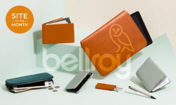
Bellroy is an Australian B Corp brand, who set up in the early 2000s, looking for a better way to create an ergonomic wallet that would accommodate the upcoming fashion trends of slim-fitting clothes. Less bulk, better use of space and responsibly sourced, high-quality materials.
Since then, the brand and their range of products have truly taken off, with cleverly designed carry solutions for everything from technology right down to house keys, being shipped worldwide. Anything that is “carried”, Bellroy will have already designed (or more than likely will be designing) a better way to do so.
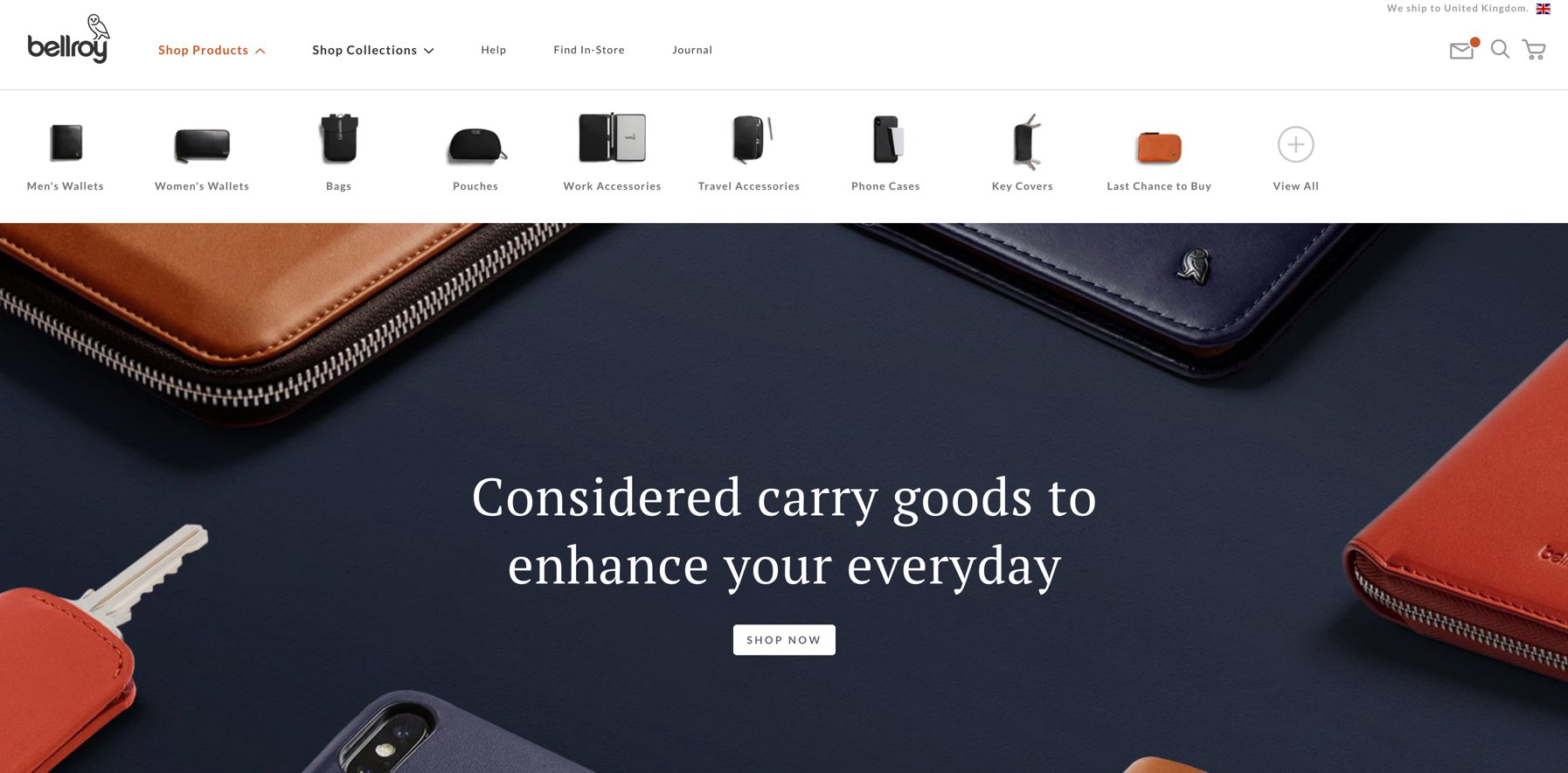
Like any of the products that Bellroy creates, the brand and the website are both high quality and slick, while simultaneously delivering personality, humour and a flash of hand-crafted flair sewn in for good measure. When landing on the homepage, glimpses of the various items that Bellroy offers, tease the eye within a large hero image spanning full width. The photography, which for me is one of the main stars of the show, exudes the quality that customers can expect, should they make a purchase, and all imagery is thoughtfully composed and visually crisp across all devices.
“considered carry goods”
With a simple one-line summary of “considered carry goods” that encompasses the nature of the product, the user is given the opportunity to dive straight into the shop through the use of a clear CTA. Typed in a serif font, it subtly nods to the traditional and yet the overall anatomy of each character has a slightly more masculine and modern air.
Moving Ahead of Competition
In my opinion, Bellroy’s best bit on the homepage, not only from a visual cue, but also from a selling point to potential new customers, comes through their stop-motion ‘About’ video. Thankfully, should users not get below the fold, they will more than likely see the same wonderful video technique used on a large majority of product pages, customised to each item. They say “a picture paints a thousand words”, and yet Bellroy takes it one step further and captures some beautifully clever moments in the short ‘narrative’ of the videos displayed, adding an extra layer of creative flair and charisma to the brand.
It demonstrates their products in the best light possible, from both a practical and aesthetic viewpoint, but it’s also the little quirks that appear throughout which leave the user engaged and better informed of their products, rather than having to read through long paragraphs of copy. FYI: there are less than 50 words on the homepage and an average of 220 unique words on the product pages!
UI & UX
Once on a category page, the format of each product thumbnail allows the focus to remain on the product being sold, with only a subtle hover status to communicate that the user can change the view of the product to see inside the product if selected. It is just the product set on a very pale grey background, or for the premium designer editions, a darker grey – yet another simple but effective way to draw attention to the more exclusive wares. In addition to the product name and price, simple round decals are positioned in the top right corner to highlight important messaging or USPs such as RFID protection. This innovative technology blocks Radio-Frequency Identification theft (also known as ‘skimming’), is achieved through a thin piece of specialised material embedded in the wallet lining.
Despite the RFID technology featuring across a wider range of products, the identifying decals only ever appear on the designer edition pieces – styled on a charcoal grey circular background to mimic that of the more exclusive range thumbnails. For the items not included in the designer’s edition, a much subtler tag alongside the product name is used. However, typed in a grey sans serif, the contrast against the pale grey background is poor and without any filtering functionality to assist searches, the user has to work that much harder to identify the products with RFID technology. While Bellroy’s range is still relatively small, I would anticipate and very much hope that filtering methods at categorisation level are incorporated into the site as more products are added.
“What I do love, however, is Bellroy’s application and functionality of the product swatch colours.”
What I do love, however, is Bellroy’s application and functionality of the product swatch colours. Simple in their appearance, these uniformed coloured circles become interactive when a user selects their preference. The product image then changes to show an actual photograph of the relevant coloured item, rather than a photoshopped image. This meticulous detail is again reflective of the quality product and brand. There is no cutting of corners and they want to enhance the user’s experience by removing as much friction as possible to quicken the buying process, demonstrating at least some key functionality at top level.
Mere-Exposure
Interestingly, the lack of a CTA button to view each product is relatively bold, however perhaps a testament to the mere-exposure effect presented by the brand’s typical demographic, who will be very used to the entire thumbnail being interactive.
Also unusually, Bellroy has opted not to have a sticky navigation, which in today’s industry is almost a given. Perhaps this is a conscious decision to encourage a more immersive browsing experience, however being so used to sticky navigations myself, I was admittedly frustrated that I had to scroll all the way back to the top of the page to click through to the checkout area, particularly when I was viewing the product range. Could this hamper the sales conversion process for some visitors? Perhaps yes.
The navigation is stripped back, with two main dropdown links for products and categories, supported by three secondary links for ‘Help’, ‘Find in Store’ and their ‘Journal’. The visual cues in the product and category dropdowns, both on desktop and mobile, are a lovely and detailed UI and UX touch, to help reaffirm and guide the user to their intended page.
Pushing SEO
I can only hypothesise that Bellroy’s recent decision to change the site structure by moving their extensive ‘About’ section from the main navigation into the footer and replacing it with a new ‘Journal’ section, is due to their hugely impactful presence within the industry. Now more widely known, they are posting blogs filled with their characterful tone of voice and design knowledge, interwoven with their company values – a great example of this is their ‘A Year in Review’. The shift in emphasis here is a far more organic, current and ever-evolving way of informing readers, and yet it still portrays the essence of their ‘About’ section, with all the added value of good SEO practices, namely relevant, optimised and engaging content with added internal links. I would be intrigued to see how many visitors still look for and click on the ‘About’ section as it is a great asset to the site.
Seamless Shopping
Upon clicking through to a specific product page, users are welcomed with yet more detailed and bespoke photography, or more often than not for popular items, a stock motion video with supporting USP prompts that automatically plays. One point of note here is that the loading times are not as streamlined as their products, with desktop speed index and interactive times averaging around 3.4 seconds each, and a shocking speed index score of 11.0 seconds on mobile, with an average of 16.0 seconds for the page to be fully interactive. However, with the use of video, and multiple large high-resolution photographs, it is not necessarily surprising.
“meticulous consideration for their customers”
Eight thumbnail product images sit under the main image, which all fit onto a laptop screen (just about), allowing users to change the main photograph and look at the features in greater detail. Like on the homepage and category landing pages, the relevant set of images is pulled through once the user changes the colour swatch and without the page needing to reload – another contributing factor to positive page loading speeds no doubt. When the colour of a product is changed, the main composition stays exactly the same, rather than taking the user back to the beginning of the image set, so as not to disturb or jar the users viewing experience. Once again, this demonstrates the level of meticulous consideration they have for their customers, and it also heightens the chance of a conversion.
To accompany the small areas of copy, Bellroy pulls through hand-drawn illustrations that were an original feature of their first iteration of the website, and equally remain peppered throughout various pages, perhaps, in particular, the ‘About’ section, where they remain from the original designs. The introduction of lifestyle photography depicts the target market and accompanies a full-width carousel that houses testimonials and the key USPs. The ‘Note Sleeve’ for example is one of Bellroy’s most popular carry items, and is supported by photography within the carousel that seamlessly continues on from the ending of the product video, showing the same model in the same clothing, presenting the item and it’s key selling features, within a relevant environment.
Below this, there is a shot of the product, complete with various complementary items that can also fit into it, in this case, the wallet. Bellroy uses this opportunity once again to bring through their playful character and meticulously detailed nature, displaying credit cards, library cards, and members cards all with Bellroy named as the business and a fictitious “Carrie Less” as the owner. Those who notice the detail and creative flair of these cheeky flourishes are not disappointed.
The mobile layout varies slightly by separating out the video and placing it further down the page below the accordion copy, only using subtle carousel arrows to scroll through the imagery rather than the thumbnail prompts. Because of the simplicity of the design, everything responds to mobile devices easily and the UX is as smooth as the desktop.
Unleashing the Purse Strings
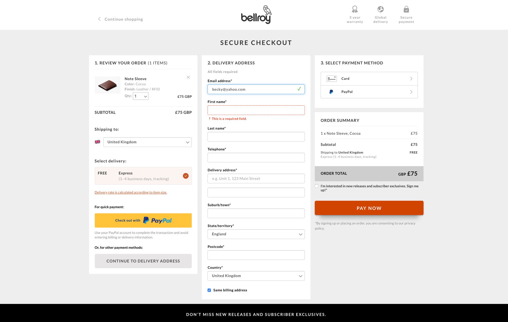
Users ready to make a purchase can rest assured that not only is the checkout process quick and pain-free, but also that Bellroy has put as much thought into this stage as the rest of their website. After placing an item into the ‘Shopping Cart’, a popup notifies the user and includes an accurate visual cue of the product, as well as a large ‘Continue to Purchase’ button, leaving no mistake as to the key conversion step. The popup remains on-screen until the customer decides whether they wish to complete their transaction or continue with their shopping experience. If users do decide to continue browsing, a simple cursor hover over the cart will remind them of what they have waiting for them upon checkout.
“A logical flow”
With a three-column layout rather than two, Bellroy maximises the overall width of a standard desktop/laptop device. Personally, I feel three columns is a little overwhelming due to all the form fields, however, Bellroy does section key areas of information in an orderly fashion, helping to break up the content into a logical flow, by titling each section as either reviewing the order, delivery details or payment method.
The auto-complete functionality works very well, which again only improves user experience, and equally the green ticks and red error messaging functionality confirms whether the user has correctly completed the form field. Similarly, the ability to remove or change the quantity of any item within the cart, or indeed switch the preferred payment method, is incredibly simple, using clear touchpoint areas such as ‘Checkout with Paypal’, ‘Order Total’ and ‘Pay Now’ CTA buttons to easily distinguish these sections from more generic form fields.
While Bellroy has a little way to go as the brand and product line develops, in terms of search and filtering progression, among other UX and CRO functionality, I equally cannot deny that when they say “better ways to carry”, I have to say “carry on Bellroy!”
Web Design with User Experience at the heart
Our user experience and design experts focus on the entire user journey from initial interaction to the final point of conversion, and beyond. Find out how our websites bring together form and function to enhance the credibility of your business, improve engagement and increase goal completions.


