With today’s advancements in how information is digitally communicated, users expect websites to provide them with key information related to their intended visit as well as be professionally designed, laid out and well thought out. Gone are days where, in the early 1990’s, you were a market leader just by having a website.
Now, whilst these are becoming the rarity rather than the norm (yes sadly some still exist), how many times have you landed on a website and instantly clicked off because you didn’t like the ‘look or feel’ of it? In most part, we are conditioned to good design (thankfully) where our perception of something is instant. We’re either emotionally connected or we’re not.
So if users are accustomed to great modern design and clear informative websites, what can help set one website apart from the competition who have an equally good product, brand and well thought through website?
Meet the microinteraction!
Now, this would imply that it’s small and therefore unimportant or inadmissible right? Errr hell no! Small it may be, but the phrase small and mighty has never been more apt.
So what is a microinteraction?
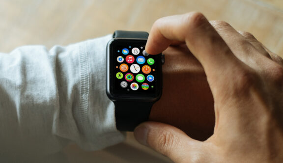
The sole purpose of a single microinteraction is to heighten the user’s awareness at a specific point within a process, through the use of design. In fact, they can be found in all aspects of daily life – our cars, appliances in our homes and apps on our digital devices, not just on websites.
Today, UX designers have the ability to create a fun and interactive way of delivering and reinforcing information that can humanise a part of a process, which may otherwise be totally mundane or unengaging. When done well, microinteractions can have a huge, positive psychological impact know as ‘Signature Moments’ and can help form UI patterns. When done poorly or not at all, it can ruin a user’s experience and be detrimental to a brand and its product.
What is this new phenomenon?
Well, you may be surprised to hear that microinteractions have been around for decades. Whilst the novelty of a scroll bar may have lost its impact since its creation in 1975, it was one of the first of its kind – seen as the new kid on the block and a revolution in digital design. Its sole purpose – to indicate where a user is on a page – remains one of the most commonly used microinteractions today.
A good microinteraction is something we should barely notice until it’s no longer there. Only then, do we realise its importance and by having that additional verification and acknowledgement, it becomes the very thing that allows us to positively continue our journey and action another task.
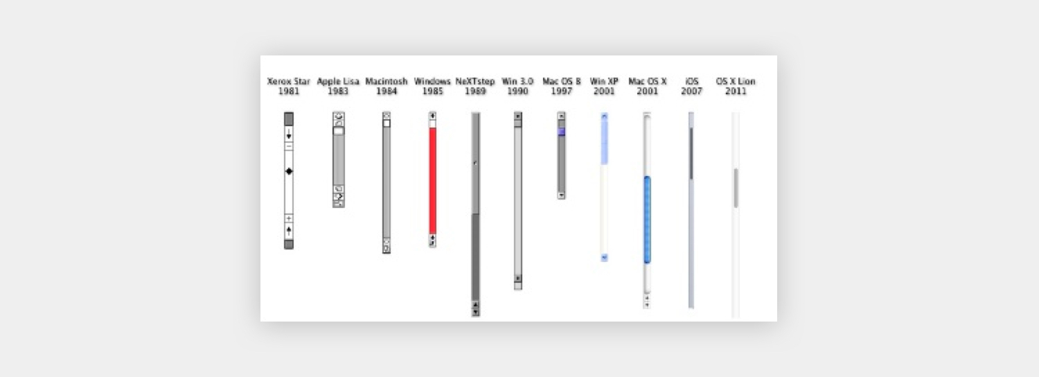
Image Source: Dan Saffer
So how is this ‘news’? What’s changed?
As technologies and their limitations have evolved and progressed, so have microinteractions. We have seen the use of interface animation become more widely adopted using movement to catch the users attention in common actions/triggers such as a swipe or toggle button. When used to great effect, animated microinteractions are literally putting the ‘e’ into e-motion.
Not only that, businesses are trying to find ways, which distinguish them from their competition, to attract and retain customer loyalty. It’s not just about the ‘bigger picture’ and the overall aesthetics of a website, which users have come to expect as the ‘norm’. The customer has become the main focus, with the emphasis now on a personal connection, with extra care and thoughtfulness going into the smaller details. So, not only making a product or service feel more ‘crafted’, but one which demonstrates a more humane approach through acknowledging a series of single actions in an engaging way. The result? A more enjoyable and satisfying experience, that more often than not, leads to a happier customer whose mood is uplifted and leaves feeling reassured and informed – feelings that are natural and very common human traits.
How to use Microinteractions
Microinteractions are best used when a key action and feedback would benefit the user, such as an acknowledgement to indicate a successful payment. Normally, this would be displayed in the format of a pop-up, confirmation screen, or something very similar. If we lived in a world without these small but impactful intonations, we would all wonder what the knock-on effect was.
Thought process: ‘Did my order actually go through?’
Action: Cue panic mode preceded by 3 days of pacing to see if the order arrives!
Nevertheless, whilst our compactful friends are intended to support a user journey by providing helpful feedback, there are certain rules of thumb that can be adopted to boost the user’s satisfaction and for them to feel ‘rewarded’, but refrains from going overboard with overcomplicated, fancy-pants gestures. Below are my top tips to sense check a good microinteraction:
1) Single task, single action
There is a danger, especially for crazy creatives like myself, to get carried away and develop a complex microinteraction animation to ‘show off’ to the users….’look at what we can do!’ If a microinteraction is anything but micro, it could be perceived as annoying. As these nuances are designed to be repeated upon each trigger, users could find themselves leaving websites – the polar opposite of its intended purpose. They should be one smooth transition with one animated element; not two, not three, just one.
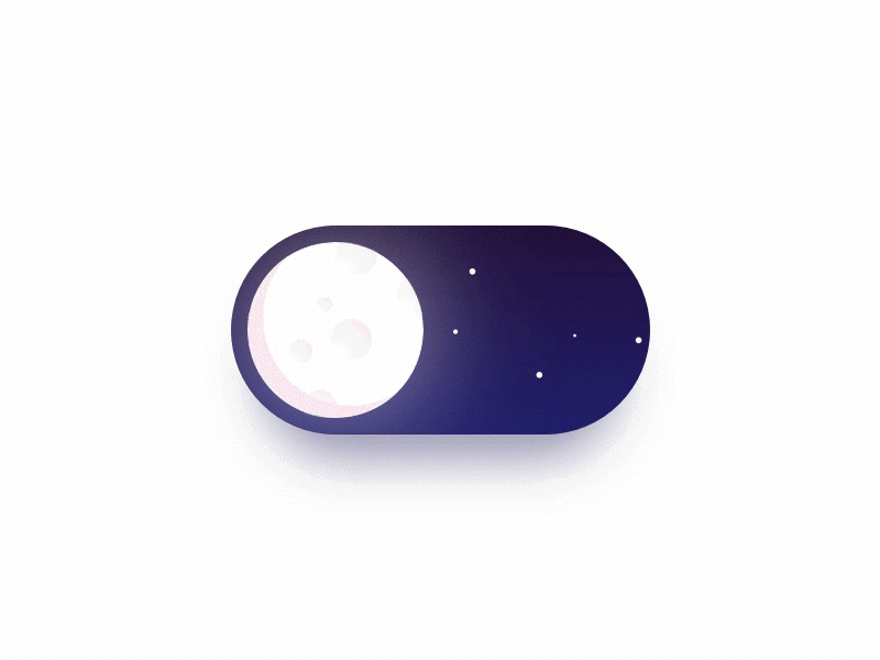
Image Source: Day/Night Mode Switcher by Alex Khoroshok
2) Does it make sense?
Is there logic in the static interface before the use of animation? Does it make sense for a single button to (big breath) totally change shape, colour, relocate to another part of the screen, increase in size and change its CTA before it even animates? Is there any need? Possibly for larger screen transitions where whole areas of content change and images change, but not for smaller actions. Let’s face it, a full 5 seconds of whizz, flash, bang, wallop would get a little tedious everytime you close a single tab! If you find yourself in this situation, it might be time for a rethink.

Image Source: Menu — close icon transition by Leonid Arestov
3) Keep it branded
Reflect the overall feeling and aesthetics of the brand including shapes and colours. Keep any key calls to action in the same tone of voice that feeds throughout the rest of the website. Don’t use serious language if you’re a quirky and friendly brand.
Image Source: giphy
4) Faster than a ‘Bolt’ of light
It’s all well and good having amazing microinteractions that have the potential to leave users beaming from ear to ear, however, if it affects the loading speed and perceived speed of the website, it will affect the overall functionality. It needs to encourage conversion, not prohibit it. The best microinteractions should give direct feedback within 0.1 seconds – so you gotta be quicker than Usain!
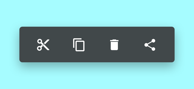
Image Source: Cut Copy Share Delete By Srikant Shetty
5) Detail, Detail, Detail
A good microinteraction should be short and sweet, but being meticulous in the type of transition is imperative. Does it fade? Pulse? Rotate? Swipe? A combination? Exhaust the best possible way to reflect the brand and other elements used in the website, but most importantly, ensure of its clarity in narrative and direction. Let it be fun and functional.
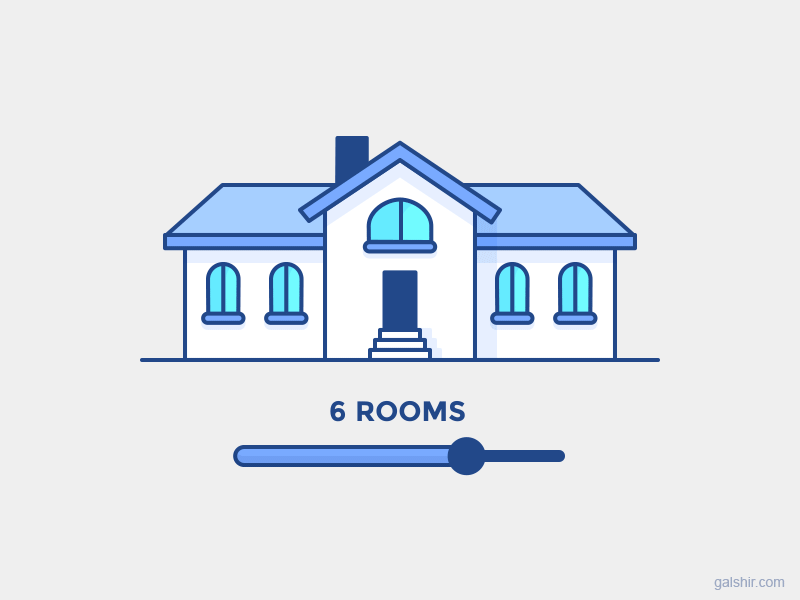
Image Source: Responsive House by Gal Shir
Key Components of Every Successful Microinteraction
Dan Saffer, product designer and author of Microinteractions: Designing With Detail, has identified the four components which all successful microinteractions share… and it’s not just their compact size.
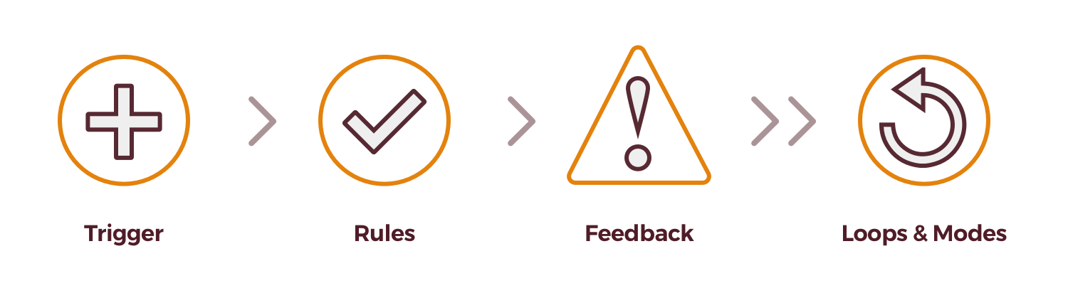
The Trigger begins a microinteraction, which is either intentionally instigated through a human action such as pressing a button or activating a voice command, or when an automatic trigger occurs when a “set of conditions have been met” (Dan Saffer) such as a sound or vibration occurring when a text message has been received. The best triggers are intuitive that can predict when and what the user will need.
The Rule subsequently occurs during the interaction and determines “what can or cannot be done” (Dan Saffer) and in what order they will occur. For example, when a send button is selected on a contact form, the form is sent to the recipient.
The Feedback is considered to be the most important stage, primarily because it confirms what the rules are to the user and emphasises what will happen as a result of their trigger – every time it is initiated. It’s also the most exciting and rewarding stage, as the use of visual, motion and aural elements can create a satisfying acknowledgment that a goal or action has been achieved and enhance the users journey by allowing them to feel a part of the experience, direct their attention to the next action and thus increase their site visit time.
It is also a great opportunity to create something totally unique to the brand, incorporating character and really giving the user a ‘feeling’ of its personality, making the site flow and humanising what is a very computerised system. Loren Brichter is famous for creating a microinteraction that has become synonymous with Twitter. ‘Pull to refresh’ became an instant hit due to the perfect logic and complete simplicity.
“Why make the user stops scrolling, lift their finger, then tap a button? Why not have them continue the gesture that they are already in the process of making? When I want to see newer stuff, I scroll up. I know I made the gesture scrolling itself.” – Loren Brichter
Loops and Modes: A loop ascertains the length of a microinteraction and whether the feedback repeats or changes. What happens when people use a microinteraction for the first, tenth, hundredth time? Ebay for example recognises when a user has bought the same item and changes the CTA on the button from ‘Buy Now’ to ‘Buy Again’. Modes are applied when there is a “critical but infrequent action” (Dan Saffer) that would affect the flow and feedback of the microinteraction. A great example of this is when a user access the weather data in different locations.
What is the future of Microinteractions?
Microinteractions have seamlessly found their way into our everyday lives and are, without doubt, here to stay in the world of UX. They are proving to give us a more enjoyable experience and save us time in all manners of speaking. When executed to the highest standard they are raising the profiles of certain brands and making them stand out from the rest of the crowd.
My final thoughts? Speaking from personal experience, I love it when I see great attention to detail and when I see a microinteraction that makes me smile, I feel like I’ve had a treat. There is real added value in humanising our digital experiences and we remember those that have made a lasting impression on us, normally with a view to revisit that website or app on more than one occasion. The end result is a positive one which leads to a higher possibility for users to convert and invest in a particular brand or product based on our previous experiences.
I think the famous designer Charles Eames inadvertently summarised the very nature of a microinteraction in its simplest and poignant form. “The details are not the details. They are the design.”