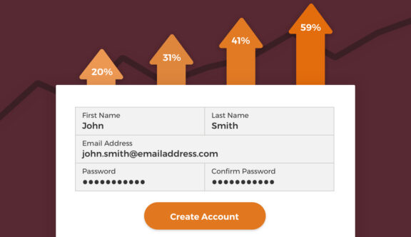
Online forms are an important part of many online conversion funnels – whether it be a contact form, an e-commerce checkout or a registration form. Designing usable forms that keep users engaged can make a remarkable difference in the overall percentage of users that convert. Read our 20 tips and find out exactly how you can start to do this yourself:
1. Set Fields To The Expected Input Length
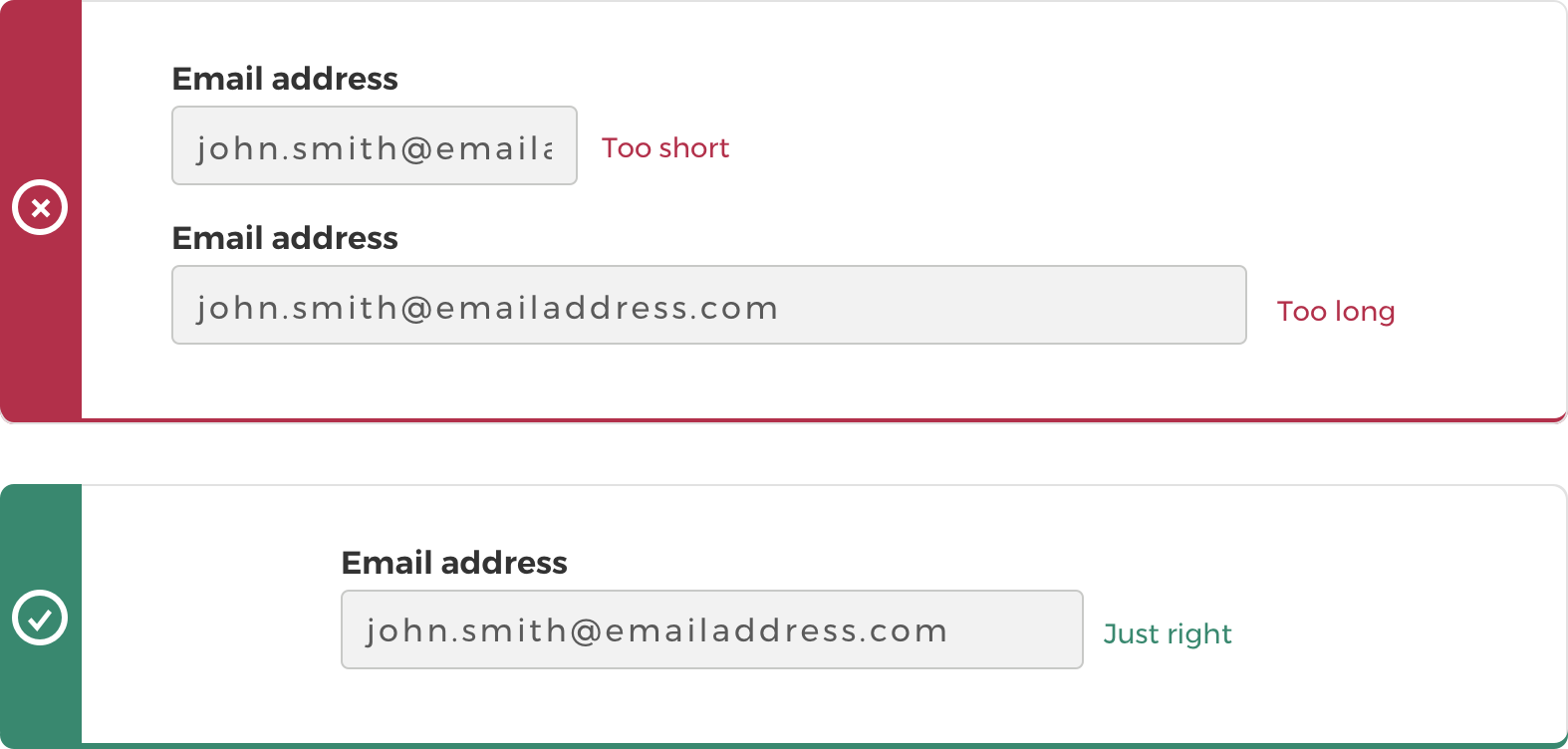
Fields that are set at the length of the expected input act as a visual cue, making it easier for users to quickly understand what you are expecting them to do. Baymard Institute outline three main types of text input fields:
Fields with a fixed input length
Fields such as the CVC code, or year of birth – where the exact number of characters being entered is known – should be adjusted to exactly match the input length

Fields with a variable input length but a normal average character length
This is the most common type of text field. Information like names or email addresses generally stay fairly close to an average number of characters – for example, most email addresses are around 25 characters. Do your research on the average character length for each field and set the length just above that, this will help to match user expectations more closely.
Fields with a variable input length and a wide range of possible character lengths
This is the trickiest type of field to set the length of, as some information may vary greatly; for example, postal codes from country to country can vastly differ in length. These fields should be sized based on the expected length of characters and may sometimes have to ignore extreme edge cases to ensure expectations are clear for the majority of users. This one ultimately comes down to common sense, along with a bit of research.
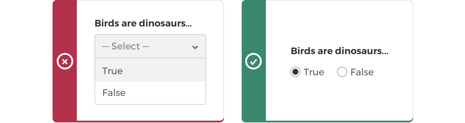
2. Keep Drop-Down Fields To A Minimum
Studies have shown that the conversion rate of forms using a single drop-down field can decrease by around 10% and forms with multiple drop-down fields fare even worse, dropping by up to 12%. Therefore, it’s really important to give full consideration as to whether a drop-down is actually the best way of displaying your information.
Use radio buttons for small lists
If you only have a small number of options in your list, you should consider using radio buttons instead. It’s best for users to have as much up-front information available as possible and to give them as few clicks as possible to reach their goal.
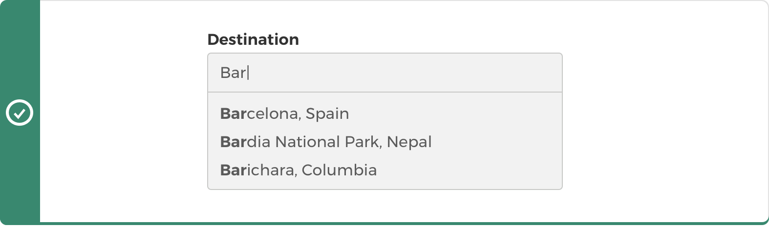
For longer lists, consider other options, such as predictive text fields
Drop-downs with lots of options can be frustrating. This is especially relevant for mobile and tablet users, as the space to show drop-down options is quite small on most native mobile interfaces. The style of your field should be decided on a case-by-case basis, depending on the audience and information you are showing – but an example where an alternative can be effective is in country/location selectors. Using an auto-complete search field that narrows down options as you type works well in this scenario as it still prompts users to select a predefined option but also allows them to narrow down their selection, rather than scrolling through reams of results.
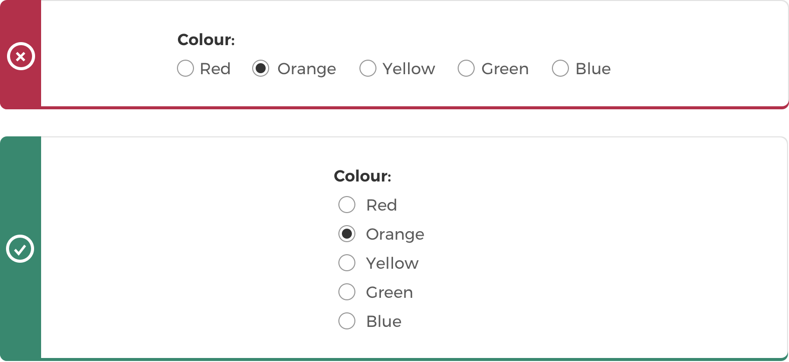
3. Use Radio Buttons & Checkboxes Correctly
Radio buttons
Radio buttons should be used for a list where options are mutually exclusive. They should also conform to a standard visual representation, such as a small circle with a second circle inside when selected.
Checkboxes
Checkboxes can be used when there is either one option that can be turned on or off, or where there are multiple items and any number can be selected. Checkboxes should be visualised as a small square with some form of cross, tick or checkmark when selected.

Whether they realise it or not, this is what users expect to see, so it’s best to observe the common visual representations for these selectors in order to avoid frustration when the form fails to behave as expected.
4. Arrange Radio Buttons & Checkbox Lists Vertically
To make your list simple and quick to use, present options in vertical columns. This makes it easier for the user to scan. It also removes any confusion over which selector belongs to which list item. If list items must be placed horizontally (which can be necessary to reduce the overall depth of the form), it is important that items are clearly spaced to reduce any confusion.
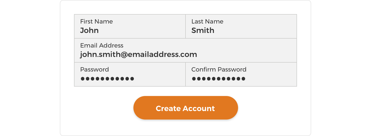
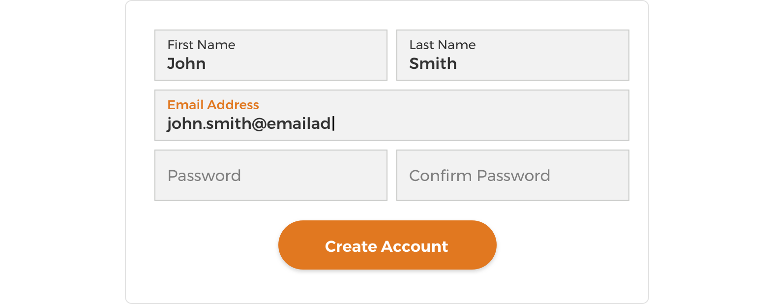
5. Pay Attention To Field Label Positioning
Most online forms use labels that sit either above or inside the field, which both present different challenges. Try to consider the pros and cons of field label positioning on a case-by-case basis.
Labels above the field
Forms with labels above the field create unnecessary dead space and the impression that there are more elements on the page for the user to complete. This can make users feel like the form is going to be more effort to fill out, potentially meaning they will exit.

Labels inside the field
Forms with labels inside the field are more space conservative and make the page tidier and less intimidating for users. The greatest challenge here is what to do with the label once the user clicks into the field and starts inputting information. Disappearing field labels can be annoying and confusing if you a) didn’t see what the label said before you clicked into it or b) are reading back to check you filled in the form correctly. Therefore it’s advisable to ensure that field labels are always made visible. Our two preferred methods for doing this are:
UX Movement’s Infield Top Aligned Labels
Read more about infield top aligned labels at uxmovement.com.
Google Material Design’s Floating Labels
Read more about Google’s text field recommendations at material.io or see an example in action created by MDS on dribble.com.
Left aligned labels
Forms with left-aligned labels are also a valid option and are easy for users to scan; however, when designing with an economy of space, floating labels are still preferable due to their versatility in responsive designs.

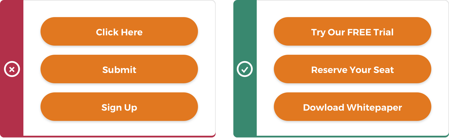
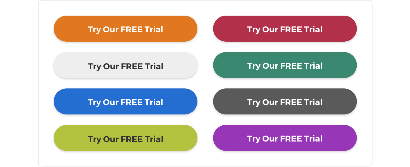
6. Button Text Should Be Clear & Unintimidating
As a general rule, button text should explain the outcome of the button click without being intimidating. There are certain words and phrases you can utilise or avoid, in order to optimise the conversion path, with ‘submit’ being the least favourite choice, reducing form conversions by up to three percent. Advice from wordstream.com is to use action-packed words like ‘get’, ‘reserve’ and ‘try’. These action words should also be supplemented with descriptive language that explains the action such as ‘Try Our Free Trial’, ‘Reserve Your Seat’ or ‘Download Whitepaper’, while making sure to keep the word count low for short and snappy button text.
7. Choose Contrasting Colours For Your Buttons
The primary goal of a CTA button is to attract the attention of the user, so it is best to use contrasting colours to ensure your button jumps out from the page. Red and orange buttons are proven to be the best converting colours due to the nature of how the human eye perceives colours at this end of the spectrum. From a design point of view, it is not always appropriate to simply ‘stick a red button in,’ but one useful technique is to use the ‘squint test’ (suggested by Michael Aagaard at Unbounce) when selecting a button colour, to help determine which colours stand out best.
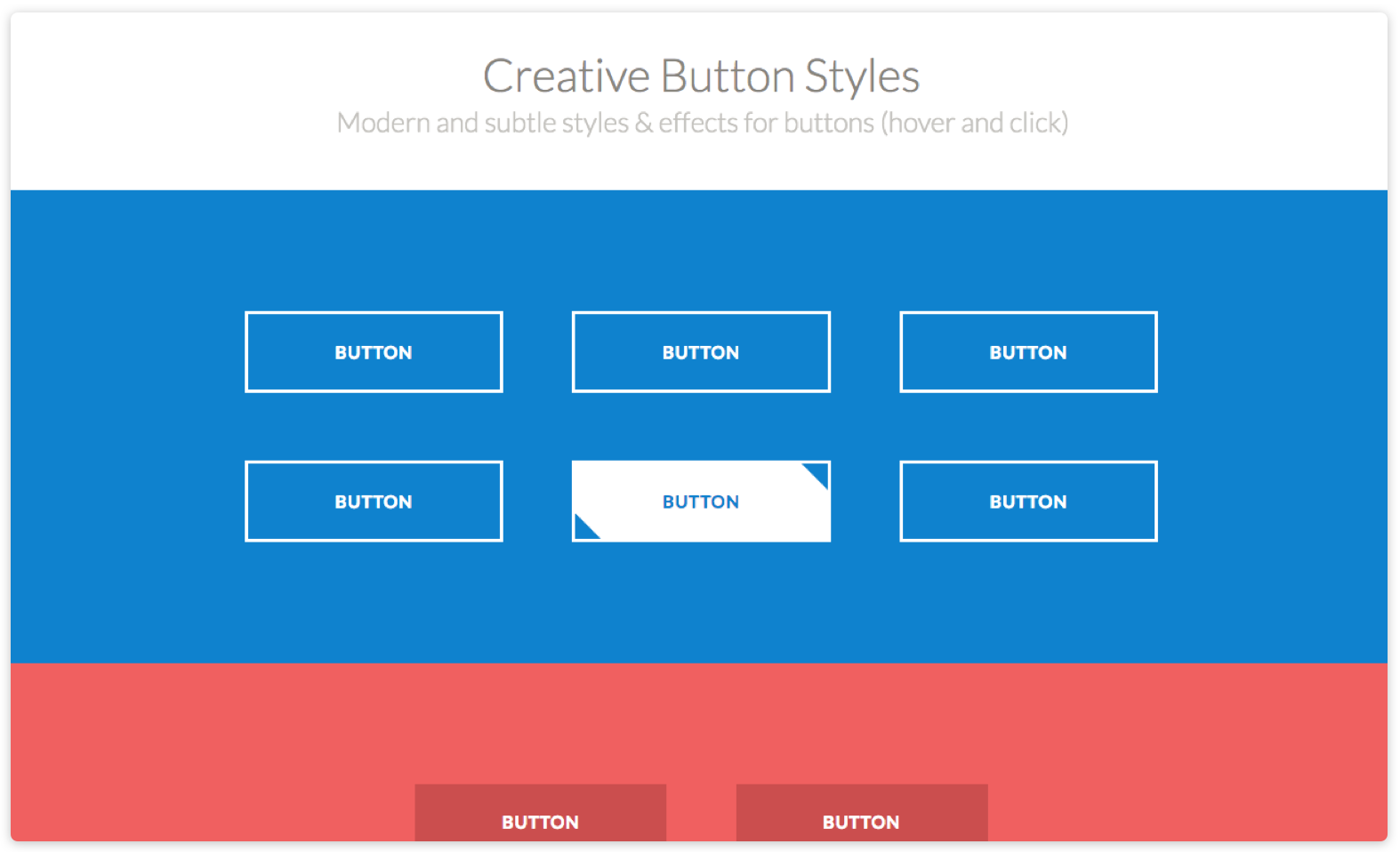
8. Make Buttons Look “Button-y”
Ultimately, users need to immediately understand that it is, in fact, a button and not another design element. This can be achieved in a variety of ways, including adding rounded corners, shading and highlights, and using hover states.

9. Demonstrate That A Button Is In Action With State Changes
Users like to be assured that an action is being completed, so make sure it’s clear when a button has been clicked. Hover states can assist you in demonstrating that buttons are clickable elements. Tympanus have put together a selection of creative button animation styles that are great inspiration for action-obvious CTAs.
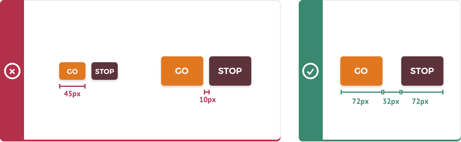
10. Size Buttons For Fingers & Thumbs
This is particularly relevant for mobile devices but is becoming increasingly relevant as more and more screens become a touchscreen. The average finger width is 45-57px and the average thumb is 72px, so any tappable elements should ideally be wider than that, to ensure the user can also see the element they are selecting whilst clicking it. You should also be careful to space buttons well to avoid accidental taps on the wrong button. More detailed information on this can be found in this Smashing Magazine article by Anthony T.
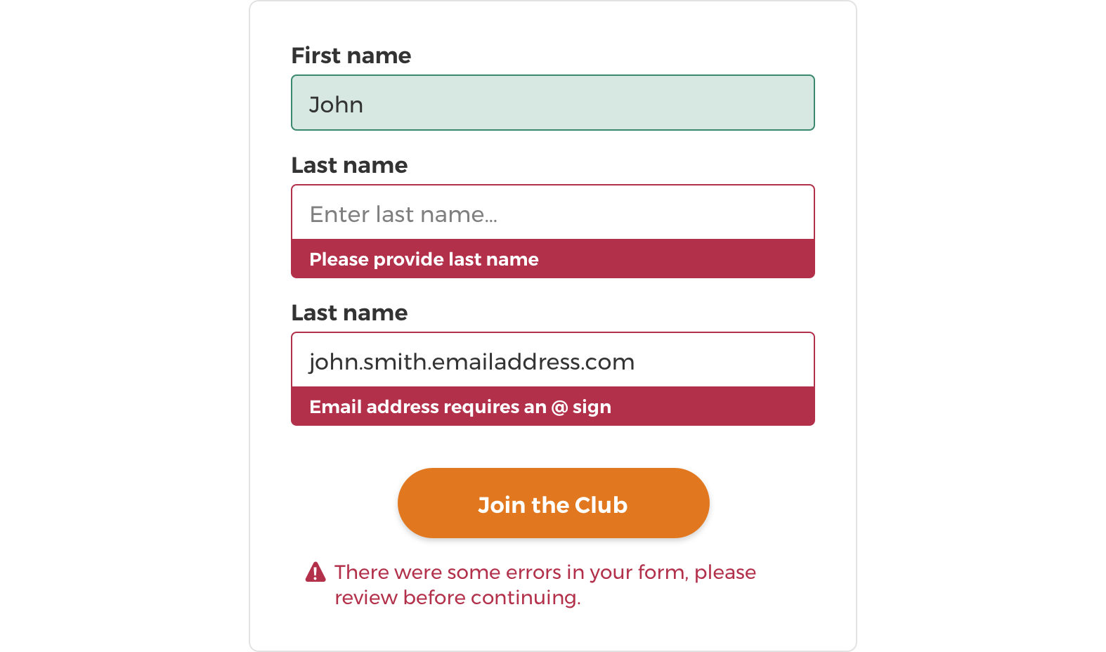
11. Use Validation Wisely
A large source of form-filling aggravation emerges when submitting incorrect information. When form validation does not make it clear what the user has done wrong, it can become irritating to search back through the form and find the mistake. There are two very simple ways of presenting form errors that will vastly improve this experience.
Show errors after form submission
The first method is to show instructions that appear after the submit button has been pressed, describing which fields are incorrectly filled or empty and what action needs to be taken. To supplement this, the relevant fields in the form should also be clearly highlighted to make them easier to find.
In-line validation
This type of validation lets the user know if they have correctly or incorrectly filled out each field as they move down the form, meaning that when they submit the form there are no surprises. Using instantaneous in-line form validation removes the frustration of finding out you’ve got something wrong after you thought you were already done. A good example of in-line validation can be seen on the Autoglass website.
On long forms, it’s often worth using both types of validation to allow users to easily find any fields they may have missed with the in-line validation. Either way, errors should definitely be flagged on-page.
12. Use In-Line Hints & Tips
By using in-line hints and tips to make your expectations for the user clear up-front you can alleviate a lot of frustration and therefore hopefully a bit of drop off.
Use microcopy to instruct users
Make it clear what information is expected by adding descriptive microcopy to accompany fields or sections.
A great example of this type of microcopy is MailChimp’s password creation field. By clearly laying out the password requirements, users know what they need to include and are less likely to be surprised by error messages. This should save users time and frustration.
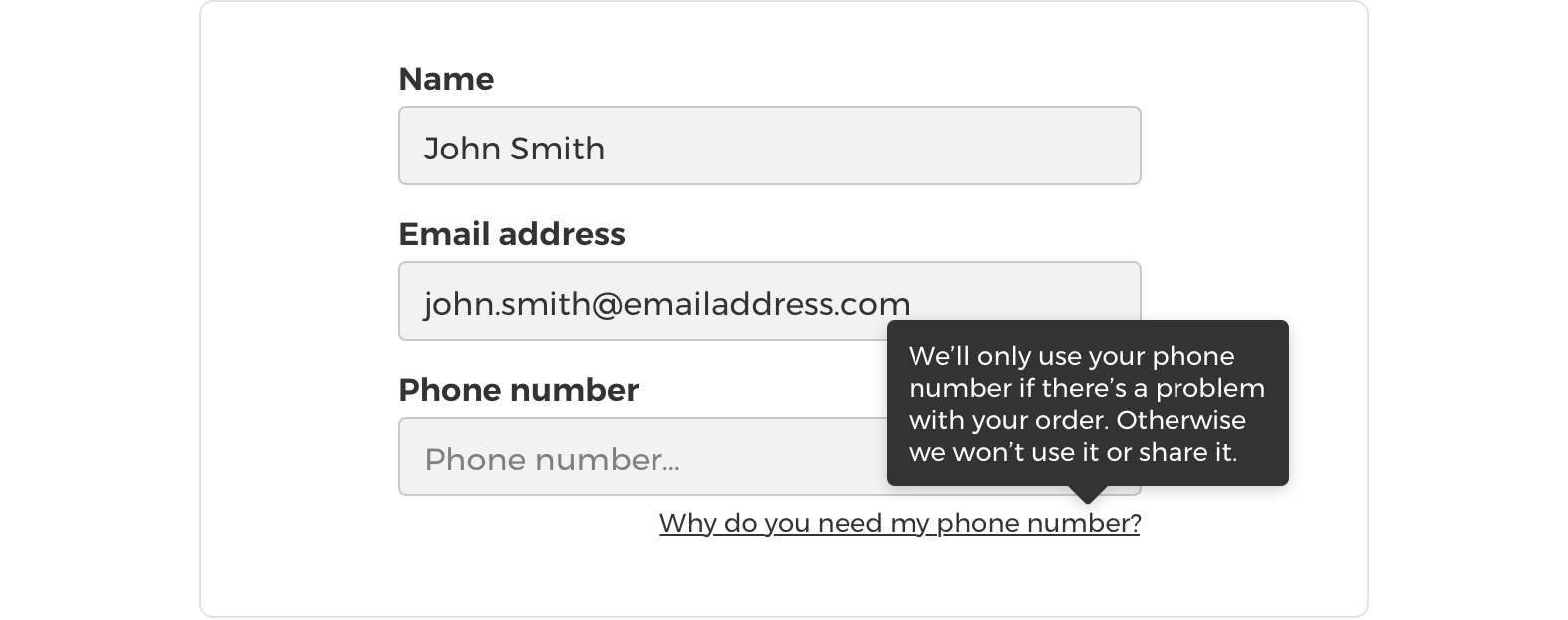
Use microcopy to comfort users
Comfort messaging can help to alleviate the concerns of more security conscious users. Users are often reluctant to input personal information such as phone numbers into forms; therefore, adding a simple message describing what the phone number will be used for, such as “your phone number will only be used if we have a question about your order” can work really well to ensure you get all the information (and conversions) you need.
Be clear and concise
Ensure any comfort messaging or instructional information is easy to understand and quick to scan, otherwise, users are liable to guess what you want instead of actually reading it.
Use positive and friendly language
Use positive and friendly messaging where possible. This is especially relevant for form validation, as users can feel defeated by cold error messaging.
For more tips on using and writing microcopy see Formisimo’s article on Inspiring Microcopy You Should Steal For Your Form.
13. Remove Unnecessary Fields
In the name of keeping your form as short as possible (and minimising the amount of effort required), always question whether any optional field is actually necessary. If it’s not, get rid of it.
14. Make It Clear Which Fields Are Mandatory
There are a couple of widely recognised ways to do this:
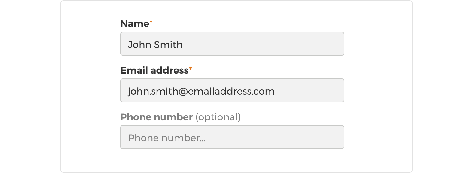
Asterisks to mark mandatory fields
The asterisk has started to become a widely recognised symbol for mandatory fields, so it could be argued that this is now part of a standard visual language that is widely understood by users. However, it’s important to question visual conventions every now and then; just because something is widely used doesn’t necessarily mean it’s best practice.
Mark optional fields only
Marking optional fields using the word ‘optional’ in brackets should reduce clutter from the form as there are likely to be fewer optional fields than mandatory. Another great way of separating optional fields (as well as labelling them ‘optional’) can be to show the field label in a lighter font colour or less bold than the mandatory fields. This adds another visual cue that allows users to very quickly separate field types and saves precious seconds.
15. Autofill Information
Wherever possible user information should be auto-filled or pre-filled to speed up form filling.
A useful example of auto-filling is where returning user data is remembered either by a user creating an account or by capturing details with cookies. Many browsers and browser extensions now also allow users to easily auto-fill their information using data stored and compiled from multiple uses across the web. It’s therefore of great importance that form fields are tagged with the correct input ID, to ensure that web browsers know which information to input where (e.g. so it knows a name field is a name field), assuring auto-filling doesn’t become more a burden than a blessing.
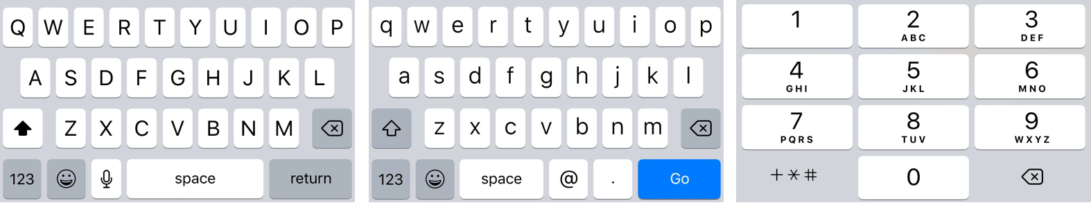
16. Use A Correct Field Input Type
As mentioned in the previous point, marking your fields up accurately can be a big time saver for users. In particular, when using touchscreen mobile devices the correct markup will determine which native keyboard appears for each field. For number fields, you will get a number keyboard straight off the bat. Similarly, for email addresses, there’s often a separate keyboard which can include all of the useful symbols and shortcuts for entering email addresses such as ‘@’.
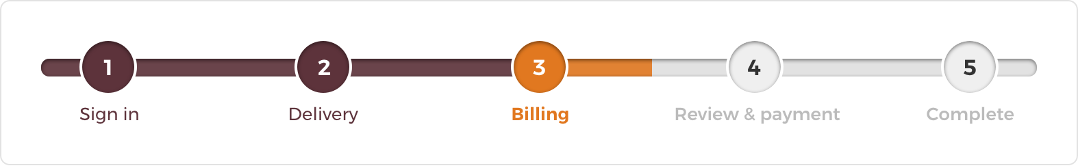
17. Stick To Single Page Formats Or Progress Bars
Try to keep your forms to one page, unless they are supposed to be really long. Mobile users will thank you if they can input their information in one swoop, especially in low signal areas. If you have to use multiple pages, make it really clear to the user how far through the form they are by using progress bars – this should prevent drop off from fed up users who keep thinking the form is over and finding yet another page of questions.
18. Keep It Simple & Design For Speed
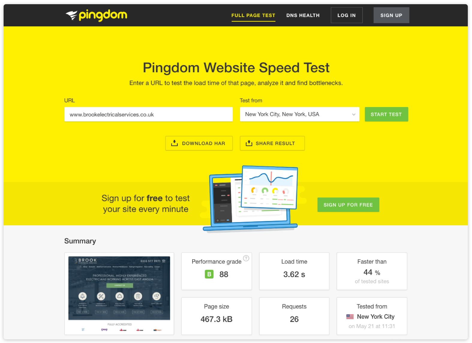
Frivolous design elements should be kept to an absolute minimum on form pages. This will not only give your users a less distracting experience, but it will also help to keep the page load time down for mobile users. To test your site speed and analyse what’s slowing you down, you can head to pingdom.com.
19. Consider Accessibility
From a moral standpoint, it’s great to ensure everyone can access your content equally, but also consider, for example, that if anyone with a sight impairment can’t use your form that’s a whole load of potential customers that you are missing out on. Something else to keep in mind is that legislation surrounding accessibility is becoming more and more relevant to websites and in some countries, such as the US, lawsuits against non-accessible websites are already becoming quite common.
Consider all interactions
When designing a page, try to account for all the different ways people interact. It’s not all about keyboards, mice and touch; people also interact through voice and audio, electronic braille devices and printed pages, to name a few.
Accessible colours
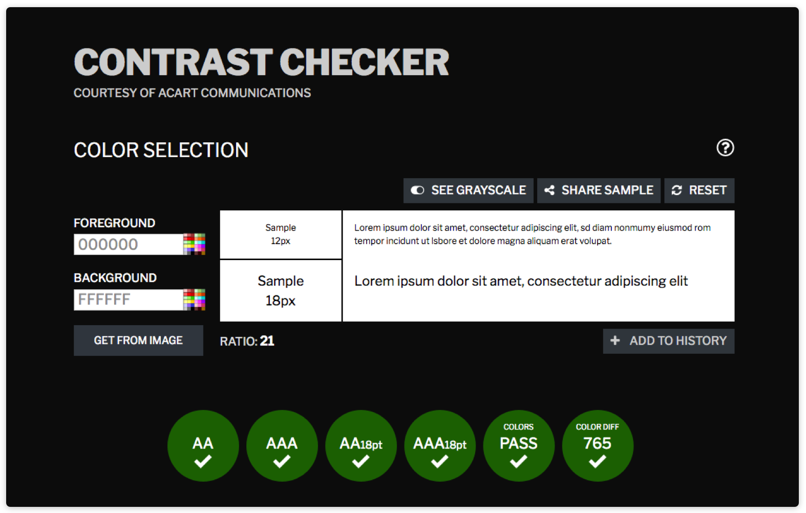
Choosing the right colours is one of the most important things you can do for accessibility. Check the contrast of your colours to make sure visually impaired users have the best chance of interacting with your form. Our favourite tool for colour contrast checking is contrastchecker.com
Accessible fields
Information hierarchy is more important than ever when it comes to accessibility. Use descriptive language for field labels and position them well to allow screen reader software to pick up the relevant information in the correct order. Also remember that for mandatory fields, asterisks probably won’t be read out by screen readers, so remember to put something in place to ensure visually impaired users know which fields are required.
Accessible markup
A large amount of HTML5 elements are accessibly supported by most browsers (see a list of supported features here), so you may not need to do much to ensure that users with assistive technology can access your site. Additionally, you can use ARIA (Accessible Rich Internet Applications) markup to add specific instructions to technologies designed to improve accessibility for users with disabilities, such as screen readers.
20. Test & Improve
Always strive to improve your forms once you have live data to help make decisions, preferably using a mix of qualitative and quantitative data as your guide. It doesn’t have to cost a fortune to collect quantitative data, you can start off by performing simple guerilla tests with friends, family and colleagues or send out a survey to site users. Analytics data and heat map software is also available for little to no cost, so there’s no excuse to live with poor performing forms!
Piece originally written by Yasmin.