
Learnability is defined as the capability of a product to enable the user to learn how to use it. In UX design learnability is a key usability feature that is often disregarded.
The main reason learnability sometimes gets overlooked is due to the fact it’s relatively hard to test or quantify. In many cases, the only accurate way of testing whether a website or app is learnable is over a long period of time, using the same users testing the interface multiple times at regular intervals. This is the type of testing that sometimes gets neglected, as it can be time and money consuming.
It’s worth noting that learnability is not the most important feature for all interfaces and some applications will have a more extreme learning curve than others by their nature. For example, a simple e-commerce website should be primarily instinctive with possibly a few simple learnable extras, whereas a complicated application for invoicing and billing could require a high level of learning before the interface can be used at full efficiency. However, arguably all systems should use some principles of learnability in order to be as effective as possible.
So how do we make a website or application learnable? In the majority of cases, website design in particular relies on the following four simple concepts:
Familiarity
Looking across a wide base of websites you will notice that there are often features that transfer from site to site. Things such as familiar icons and layouts act as interaction cues and allow the user to immediately understand the very basic functions, meaning that we can learn the specific intricacies of a site quicker without worrying about learning the core functions first.
Navigation is a key usability consideration in website and app design and many interfaces adopt a familiar format of guiding users through their experience. For example, on desktop website breakpoints and applications a navigation bar running across the top of the screen is widely used and almost expected (just take a look at our StrategiQ website navigation – we’re doing it too!). Breaking from this format doesn’t mean that a website will be un-learnable, but this is certainly one composition that has been tried and tested and I think we can all agree works on the basis that most users will immediately understand how to use it.
Something else you may notice in your journeys through websites and other systems is a familiar set of icons. The floppy disk icon is a great example of this, even though floppy disks have actually been out of popular use since the early 2000s, we still all know this symbol as the ‘Save’ button.
Other icon examples include the search magnifying glass icon, a shopping cart or basket to view what’s in your virtual shopping basket and an ‘old-school’ landline telephone symbol which often works as a standalone click-to-call link on many mobile phone apps.
One final interesting example is also the ‘burger menu’ symbol. This is a relatively new one but those three parallel lines have become so recognisable that they seem to be becoming an industry standard for showing a menu, particularly on mobile devices.
![]()
Comprehensibility
This is a short and hopefully fairly obvious point, but if your interface is not comprehensible it will not be learnable. We need to make sure that every action we want the user to take is easy to understand, for example the language that you use must be clear and direct; fields, buttons and links should clearly describe the next step the user will take. Similarly to the point about familiarity, a button should also look like a button; this makes the action you want the user to take easy to comprehend.
Evidence Actions
In addition to making sure actions are comprehensible it’s also important to make sure the user has evidence of their actions, this helps to reinforce what reaction each operation produces throughout the journey. If the user is given clear evidence that the action they made gave a particular output they are much more likely to learn and remember this action for future interactions, therefore allowing them to complete their desired journey more efficiently the second time around.
To give an example of this, a form submission often results in either a thank-you page if the form has been successfully submitted, or alternatively a site will often give warning messages if a mandatory field has been missed or filled in incorrectly. Both of these are important feedback in terms of teaching the user how the form works and – assuming the thank-you message is written correctly – what the expected next action will be.
Another simple idea for evidencing actions is button animation. If a user gets a reaction from clicking a button or hovering over a button, it makes the user journey not only more satisfying but also much more informative. Have a look at this Tympanus Demo for some examples of elegant button animation solutions.
Simplicity
Another fairly obvious but incredibly important aspect of web interface design is keeping things simple. This is vital to learnability. There is nothing worse for a user journey than an overcrowded page with too many competing elements. In terms of learnability and usability, page hierarchy is key. Your primary actions should be immediately visible and obvious, with secondary options still remaining clear and understandable, but not working in competition with the main points.
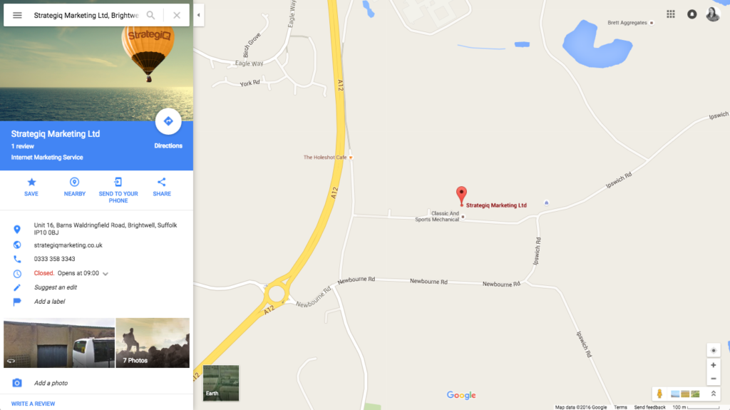
A fantastic example of learnability created through simplicity is Google Maps. As an initial user, you can quickly and easily find a destination and plan a route; these are the very clear primary actions of the map functionality. Where Google really comes into its own is with a multitude of secondary learnable features. The basic secondary features include map exploration features, such as zoom, Google Earth and drag-to-change map routes. These controls are also presented very clearly and simply, but do not overpower the main purpose of the interface, which is searching for locations.
Even the search field itself has learnable features. For example, the placeholder text in the search text field will sometimes suggest searching for ‘restaurants’ or ‘coffee shops’ near you, teaching the user that you don’t have to be specific with your search and you can still expect to see results.
After searching for a destination there is an abundance of secondary options to choose from, too much to go into in one blog article. Needless to say the second level of navigation that Google Maps provides after a location has been searched is laid out seamlessly; the information presented varies massively from location to location and is also dependent on whether multiple locations are found or not, but in every scenario the information is set out in clear sections using discernible icons, straightforward information hierarchy and descriptive link labelling.
If you’re a regular Google Maps user then think back to when you first used it. Chances are that you are now able to navigate through the interface and find a large body of information about an area, business or route with very little concentration. It has probably taken you at least a few attempts to develop this kind of confidence and efficiency with the system.
As we touched on earlier, testing learnability is important, especially with complicated website structures. If the budget, time and inclination to improve efficiency is there, it is definitely worth considering using periodic user testing to test usability over time. It’s not a simple thing to test, and results can be hard to analyse appropriately, but if you can achieve improved learnability chances are it will help you attain a more loyal user base.