Colour has been proven to impact people physically, psychologically and sociologically, which is why it is something every company should think about when contemplating what the brand should be and look like. According to a research study published in the Journal of Behaviour and Information Technology, visual appeal can be assessed within 50 ms, suggesting that designers have a very short time to make a positive first impression. In addition, another study noted that using certain colours in your branding can increase your selling potential and help customers remember your brand as well.
Bearing this in mind, choosing the most appropriate colour for your brand is extremely important because it has the ability to capture of the attention of prospective customers and persuade them that they need or want to use your product or service.
Unfortunately for designers and marketers, choosing a brand’s colour scheme can sometimes be tricky because there is no universal meaning behind any colour because there are many factors that can affect emotional colour perception, such as experiences, upbringing and personal choice. These factors are almost impossible to design for, but with a bit of research into your customer demographic and psychographic preferences, you have a better chance of attracting business.
Here are some key areas that you should focus on when researching your target clientele and choosing a brand colour/s:
Age
Choosing a brand colour and design that resonates across multiple age groups is a challenge that many designers face because our colour preferences change over time and how we attribute colours to certain emotions also changes with age too.
For instance, an early practitioner in the colour industry and author of Color Psychology and Color Therapy, Faber Birren found that as people mature they begin to prefer hues of shorter wavelength (blue, green, purple) than hues of longer wavelength (red, orange and yellow).
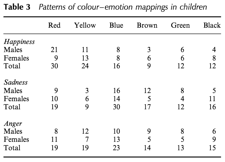
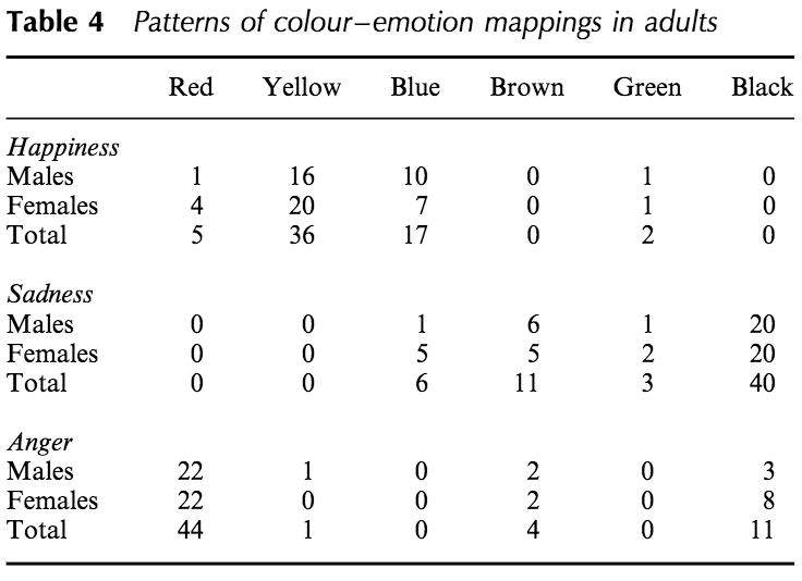
In addition to this, Marcel Zentner, in the Journal of Developmental Science, suggests that children map emotion to colour differently as compared to adults. In his study, he found that children tend to associate a variety of bright colours (yellow, red, etc.) with happiness and a range of dark colours (blue, green, etc.) with sadness.
However, adults differ by comparison because they see red as representing anger and also tend to be more distinct in their colour association i.e. yellow is definitely happy and black is definitely sadness. This is intriguing, especially regarding adult findings because associations seem to become more polar i.e. darker and brighter as people age with regards to certain emotion.
Collectively, these findings suggest that if your product or service has a clear target age, considering changes in colour inclination and perception is key.
Gender
Heavily backed by research, it isn’t a surprise that variances in gender can influence the desire of certain colours. In fact, a study that collected responses from 1924 males and 3766 females, confirmed previous study findings, which stated that males are more likely to prefer blue, black and red, while females are more likely to prefer pink and purple.
Also, while this cannot necessarily explain why different genders prefer certain colours indefinitely, biologically, males and females differ in their (average)responsiveness to particular dimensions of colour space and each have more retina sensitivity to the preferred colours mentioned above. So, this suggests that even physiologically, males and females are drawn to different colours.
Bearing this in mind, businesses should be mindful especially if they are branding a product or service with a specific gender-bias. On the other hand, it has also been shown that as the world moves toward more equality and less of “pink is for girls and blue is for boys,” younger generations are becoming less and less likely to strongly prefer certain colours.
Culture & Socialisation
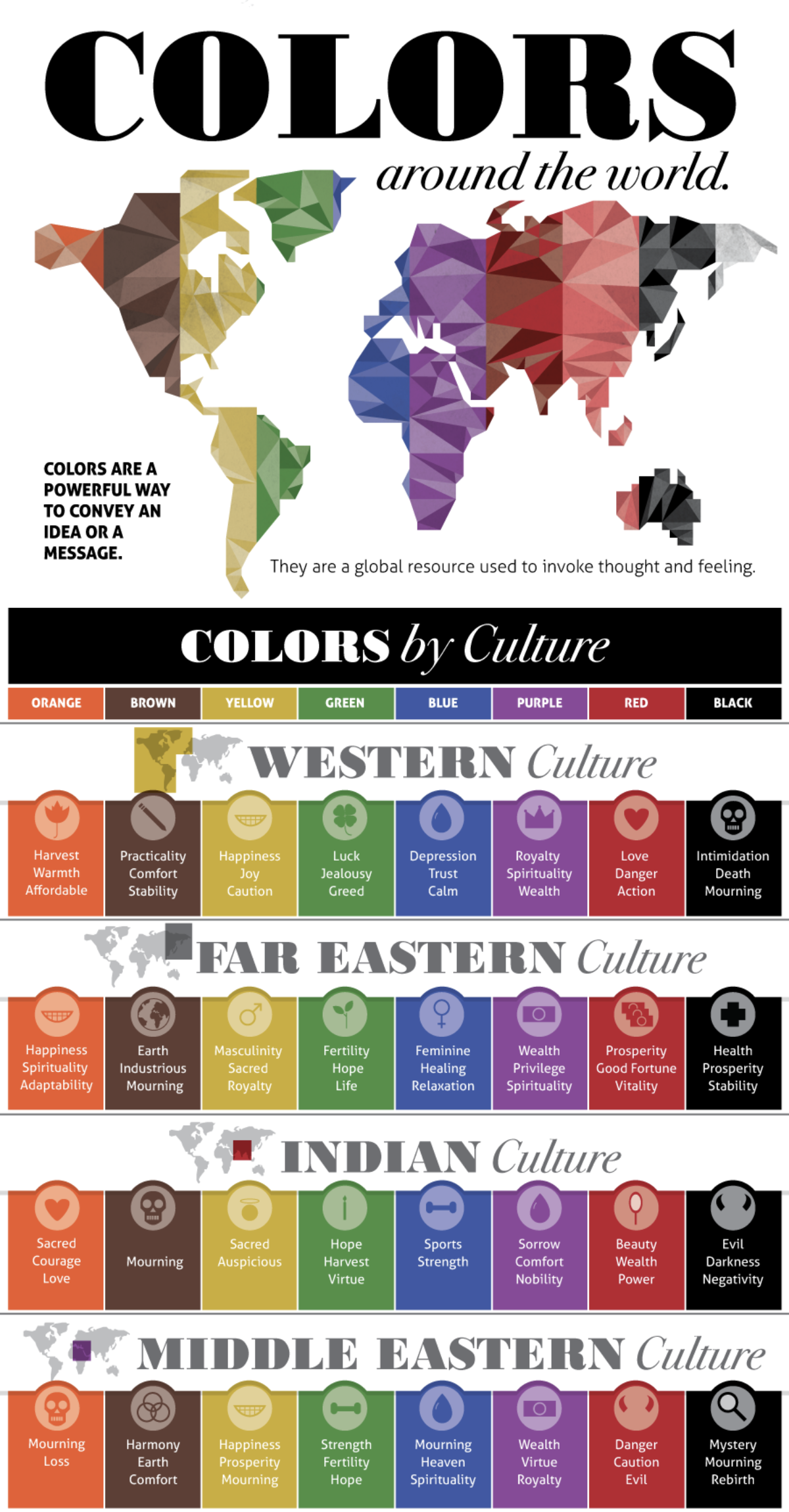
Cultural influences and preference socialisation in reference to these are two of the biggest contributors to the perception of colour meanings and our ‘learnt’ emotional connections to them. So, if you are considering expanding a business internationally, having multiple versions of your brand may be beneficial. For instance, in the infographic below, you can see that while there are some similarities between some cultures, there are many colours with quite opposing connotations across the world.
In addition to this, while not mentioned on the infographic, white is a colour that is perceived differently by different groups of people. In western culture, white is often seen as a pure, elegant and clean, and used for weddings and christenings. It is also associated with angels in many cultures. However, in a number of far eastern Asian cultures, white is seen as quite the opposite, representing mourning and bad luck and is traditionally worn at funerals.
So, as companies become more global, it’s important to consider these factors, taking into account that using the wrong colour could immediately put a large chunk of the global market off your brand.
Industry & Context
While age, gender and culture are important factors to consider, it is also beneficial to sometimes stick to classically used industry colours, as customers can view some colours as being inappropriate for certain sectors, making them view you as less credible.
While there is no particular set of designated colours per sector, but there are clear patterns between the types of colours used. For example, in the automotive industry there are a few colour variations used, but in general, most brands go for deep blues, bright reds, blacks and silver. These are all commanding colours with a strong presence and relatively strong intensity. If you used a pastel pink to brand an automotive brand like these, it’s unlikely that it would be deemed appropriate and therefore might lack credibility.
In another example, green is often a colour used by companies in the energy and renewables sector because it suggests that the company is ‘environmentally’ friendly. This is key as we move toward a more sustainable future. Also, as a bonus, green also suggests growth and prosperity across multiple cultures – making it more trustworthy.
However, it’s important not to forget that breaking the mould can also make your brand stand out from the crowd. Using a colour scheme that differentiates from the competition is a good way of attracting attention, especially for brands that are likely to be compared with their competitors before customers make a choice to use them.
Colour Variations
Colours are often referred to in terms of their purest form when examining their perceived meanings, for example, red can be seen as representing anger or romance. The average human eye can see around 10 million colours, so it is worth mentioning that each of the basic colours has numerous variation possibilities, each with their own potentially differing perceived meanings.
An example of this would be the varying greens used by Spotify and Starbucks…
“Spotify wanted their logo to reflect the vibrancy of their industry – the neon green chosen as part of their recent redesign now pops, communicating the fresh and modern music Spotify releases daily. While Starbuck’s green is intended to promote international peace, not to mention stability and consistency in their product.” – Fat Rabbit Creative
The deep Starbucks green is also used to create a sense of calm, allowing people to take time out of their busy days to sit down for a coffee break.
Evidently – considering one green can say innovation and vibrancy, whereas another can be used to reflect a sense of peace and relaxation – choosing the wrong colour brightness or intensity has the potential to significantly affect the perceived meaning behind your branding.
Colour Combinations
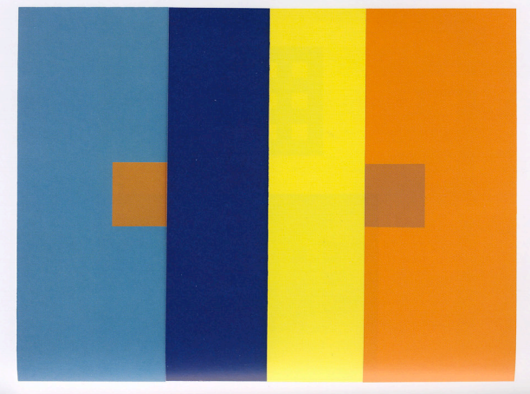
When thinking about colour meanings it should also be noted that colour combinations can affect the individual colour meanings. In fact, when placed next to a variety of colours, one colour can be perceived as a completely different shade.
Josef Albers writes about many studies referencing how colours behave when placed alongside each other in his book, Interaction of Colour. In the below study, he points out that the two small orange squares are exactly the same colour yet “no normal human eye is able to see both squares-alike.”
The take away from this being that as well as making sure the individual colours are appropriate for the brand, it goes without saying that they also need to work together effectively to create the desired perception.
Wrap Up
Essentially, there are no easy answers when it comes to choosing brand colour schemes and there certainly is no set of definitive rules you can follow; however, by analysing your target audience in as much detail as possible, and considering their generalised preferences and perceptions, you should be able to get pretty close for the majority of your audience.
If you would like some guidance or assistance with your branding and colour schemes, please get in touch.


