Rawnet – Powerfully Breaking the Mould
This week’s winner is Rawnet!
Rawnet are a digital agency based in Berkshire. Needless to say, it’s important for digital creative agencies to really nail their website design in order to showcase their skill in the field.
The Rawnet creative team have gone one step further than just creating a good-looking website, devising something that’s not only functional but breaks powerfully from the mould.
Their homepage opening screen is super-simple, made up of a plain white background with centralised text that briefly explains what they do. On the desktop breakpoint there is a thin bright red navigation bar running down the left-hand side, which against the white background is very visually prominent. Running site navigation down one side of the page is very trendy at the moment, but there is a danger that some users who are used to a traditional top nav bar could find this jarring to begin with. Therefore, creating a highly contrasting sidebar, that really stands out when you first enter the site, helps teach new users how to manoeuvre through the content.
They also use a burger style menu through all breakpoints of the site; another trend of the moment, which also has some potentially negative user experience implications. However, another helpful tactic employed on the desktop site is that they have simply placed the word ‘menu’ underneath the burger symbol, which again ensures all users are clear on how to find navigation features, but allows them to keep on trend.
Once you navigate past the opening screen (either by scrolling or selecting the case study or team page from the navigation) you will get to see the full magnificence of the site.
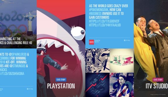
On the desktop version of the site the page scrolls sideways, revealing a beautiful system of blocks that extend from top to bottom of the screen. As you scroll the page these blocks spin into view, giving them a card-like appearance and giving the page a feeling of constant and exciting motion. As you hover over the exquisite photography, jaunty coloured shapes emerge and highlight content titles; this helps to keep it nice and clear which blocks are clickable amongst the rest of the static photography.
The sideways-scrolling, full height block system transitions absolutely perfectly onto the tablet and mobile breakpoints, moving into a more traditional but equally visually impressive vertical scroll system.
Some of the more content-heavy pages of the site follow a more traditional vertical format across all breakpoints; however, this has not stopped the Rawnet team from continuing to break the mould.
Every vertically organised page begins with a full-screen background image, overlaid with title text and often a selection of anchored links to help you navigate to specific points on the page.
There are so many beautiful subtleties across the site, but a stand out across the site is the abundance of perfectly executed micro-interactions. Every single clickable item seems to animate in some way and each transition is smooth and well thought through. There’s a lot going on within the pages, yet somehow it never feels overpowering and instead leaves you feeling excited and wanting to hover and click on more things.
The site leaves you with the impression that Rawnet has a playful and confident approach to website design as well as a bold brand personality. It’s an absolutely gorgeous experience from beginning to end and the more you explore it the more stimulation you’ll find.
Do you have a site you want us to look at?
Every week, the StrategiQ team are looking for their favourite website of the week – so tweet at us or email us a suffolk@strategiq.co to get featured!
Or, are you a potential client and want our web designers or web developers to have a look at your website? Get in touch!
In the meantime, check out our client case studies!
