Obrigado – Vibrant, Playful Microinteractions
This week’s winner is Obrigado, a Brazilian company who produce pure coconut water from home grown coconuts in Bahia. With a gorgeously designed promotional homepage that includes vibrant, playful microinteractions and engaging messaging, it was easy for me to ‘lose’ time and delve further to find out more about this brand.
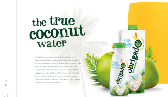
The design of the landing page largely mimics the packaging and branding of the product, combining hand drawn qualities with modern, slick user interfaces. A white background provides a fresh blank canvas indicative of both the Bahia sandy beaches and symbolic of the purity in Obrigados product, allowing the product and large animated strapline to remain the focal point. A large splash of vivid yellow housed in a somewhat less than uniformed rectangle that very subtly changes shape catches your eye. Not only does this inject energy and further visual intrigue to the page, it is deliberately placed behind the product and coupled with an animated palm leaf to draw your eye in further and make the product ping off the page.
I love the unrefined and organic appearance of their hand-drawn serif typeface which is used for the headers, as it further adds to the playful character of the website and brand. The inclusion of the angled hero title which animates in as you initially land on the homepage, the unrefined edges of the panels of colour and hand-drawn navigation icons, emphasises the company’s down to earth and hands-on approach and echoes both Obrigados ethos and product, that natural is best.
Introducing Side Sticky Navigation
In recent website design, the introduction of a side sticky navigation has become quite a trendy feature and although most would assume that the primary menu of a website would be situated at the top and above the main content to ensure solid user experience, Obrigado has adopted a side fixed menu. They haven’t stopped there however – the UI and flow has been ‘rotated’ by 90 degrees enabling the homepage to scroll horizontally rather than vertically. This deliberate design element lends itself perfectly to the use of a side menu, as it always remains ‘at the top’ of the content on the homepage. A lovely touch which again just adds to the user experience.
As the user scrolls along the homepage, the first of many beautiful photographs appear which are peppered amongst the key messaging. The photographs are natural in their composition and feel safely out of harms way from any filters or heavy-handed photoshop work – they are real and honest, showing the friendly faces at the heart of the brand’s persona and make the company feel grounded and approachable.
The layering and placement of all these assets are relatively non-conventional and doesn’t conform to the rigid grid-like structure seen in most current website design, which is a notable and refreshing change. Instead the design is more organic and fluid and again channels the brand, their ethos and the product.
Microinteractions
The site uses subtle hover status’ and microinteractions throughout, which improves the UX by making the UI less machine-like but instead more human and engaging. The visually stimulating cue that initiates the action affirms to the user how to use the site and where they should click to discover more, thus creating a habit loop. As a result, the design is more usable and enjoyable which provides us with an experience rather than being presented with static information. In particular, I like the illustrated droplets that animate around the menu/close navigation.
One of my favourite elements to this website is the inclusion of a scroll reveal that shows in its simplest form (with a little artistic licence) the uncomplicated and unrefined process used to harvest and extract the coconut water from the plant, straight to the bottle. Despite the technical complexities of this transition, it is so cleverly simple both in message and design, and its uber smooth transition makes it a pleasure to interact with. Its intended purpose subconsciously mirrors the sales message that you, the user, are buying an unprocessed product as nature intended. Neither the appearance of the UX, or product is complicated – genius.
The continual use of transitions are cleverly adapted to the design and the brand. By dragging or clicking the coloured illustrated arrows not only activates a microinteraction but seamlessly animates you through to one of the internal pages as the colour from the arrow appears to seep across the entire screen, filling it with its colour to create a vivid background. This block colour allows for a solitary title to sit centrally to the page thus allowing the minimal menu, close navigation and subtle scroll prompt to ping off the page. Acting as a ‘palette cleanser’ or starting point for the user, it highlights where the basic navigation permanently resides should they need to navigate elsewhere and reassures the user that amidst the use of clever design and transitions, the user journey and ease of navigation remains paramount.
The internal pages reflect the same look and feel as the homepage, although in a more traditional manner adopts the use of vertical scrolling. The language and messaging used within the website is friendly and does not appear particularly sales led despite the product being clearly placed, largely visible and coupled with its health benefits. The nature of their marketing is clever and lends itself to appeal to the open minded nature of the consumer, particularly those who share the same health conscious ideals and perhaps purchase other whole food products that focus on the wider wellbeing. The language touches heavily upon the four points of sustainability; covering environmental, social, economic and human benefits. Their endeavour to nurture the local community through project work, helping local schools and ensuring local farmers (known as ‘Aristas’) have the independence of managing their own parcel of land, is highly commendable and adds to their likability as a brand.
In a ‘coconut’ shell, I think this website does more than ‘sell’ its product beautifully. It educates, engages and encourages users to review lifestyle choices, not only from a health perspective, but also triggers the thought process of supporting smaller companies with a global outreach who ethically try to make a difference, not only to their end consumer, but aspire to give something back to its local community and make a difference by becoming environmentally viable and self-sustainable. Food for thought.
Check out their website to see for yourself.
Do you have a site you want us to look at?
Every week, the StrategiQ team are looking for their favourite website of the week – so tweet at us or email us a suffolk@strategiq.co to get featured!
Or, are you a potential client and want our web designers or web developers to have a look at your website? Get in touch!
In the meantime, check out our client case studies!