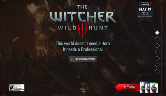
The Witcher 3: Wild Hunt – Dynamic Use of Video
Video game websites often forget that their greatest asset is the dynamic in game footage and trailers that they boast. Essentially, the product is their greatest tool. The website for the Witcher 3 uses some of the most dramatic game footage seen this year as a backdrop to the information on the site. Constantly moving and switching between epic action sequences, the use of video keeps the site forever fresh and interesting.
Simple Parallax Navigation
With such a plethora of exciting footage and screenshots throughout the website, the need for an over the top functionality or navigation is placated, instead replaced with a simple parallax, which does nothing to take away from the product and instead allows the site to be displayed in its full glory. The right hand icons give the user a greater element of control over the content and the way in which they experience the site.
Content Bites
As the website for one of the year’s standout video games, the Witcher 3 site could wax lyrical about its product in a essay of superlatives. The makers of the website however, have identified the key points and information that the users want to read about and introduced small snippets of content throughout that drip feed only the most relevant pieces of information, as the user needs it.
To visit the Witcher 3: Wild Hunt site, click here.
Do you have a site you want us to look at?
Every week, the StrategiQ team are looking for their favourite website of the week – so tweet at us or email us a suffolk@strategiq.co to get featured!
Or, are you a potential client and want our web designers or web developers to have a look at your website? Get in touch!
In the meantime, check out our client case studies!
