Read why we chose Natural Food & Beverages this week!
Elegant Animations
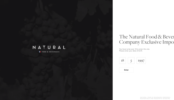
The site contains a number of smooth and slick animations throughout, which feel absolutely natural and fitting with the site, never being a barrier for the user experience. The site carries with it a very high end feel, which plays an important role in how the website reflects its brand. The animations are equally as elegant, and only add to what is a beautiful website design.
Consistent Design
Consistently throughout the website, the design remains split through the middle with the menu on the left hand side of the page and minimal content on the right hand side of the page. This layout works well in tandem with the video content throughout, but also allows the website to foreground its own elegance and luxury. Equally important is how the website uses colour, or indeed a lack of colour, remaining endlessly elegant throughout.
Attractive Typography
The site does an excellent job of matching an elegant font with the elegant persona of the website. This collation of factors helps to give the brand some life, and make it clear to the audience that this is a high end, aspirational brand. As browsers explore the site further, this becomes ever clearer based on the use of sharp imagery.
To visit the Natural Food & Beverages site, click here.
Do you have a site you want us to look at?
Every week, the StrategiQ team are looking for their favourite website of the week – so tweet at us or email us a suffolk@strategiq.co to get featured!
Or, are you a potential client and want our web designers or web developers to have a look at your website? Get in touch!
In the meantime, check out our client case studies!
