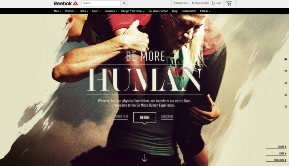
See why Reebok – Be More Human is this week’s winner!
Video
The site makes excellent use of video as part of the parallax, forming a background to the ghost navigation. Their gritty style of filming is in keeping with the message of the website and is an important tool in its success.
Transition
The site’s transitions in its parallax function add a certain dynamism to the homepage, again in keeping with the brand and offering am interesting juxtaposition against other imagery.
Test
The site actively encourages the user to get involved with the website and its test function is the perfect way of doing so. In testing people’s human-ness, the website asks some fairly random questions, but ones that will definitely get people thinking. In terms of user interactivity, this is a really nice addition.
Design Your Own
On many sports brand sites, a design your own function is an important addition and this website is no different. Fitting into the website’s nice design, the customization tool is a fun addition that again adds to the ideal of user interactivity.
Imagery
Finally, it is important to speak about the site’s clever use of imagery throughout. Its strong use of grainy hero images help to the define the site’s persona and give it the unique appeal that makes it this week’s, Website of the Week.
To visit the Reebok site, click here.
Do you have a site you want us to look at?
Every week, the StrategiQ team are looking for their favourite website of the week – so tweet at us or email us a suffolk@strategiq.co to get featured!
Or, are you a potential client and want our web designers or web developers to have a look at your website? Get in touch!
In the meantime, check out our client case studies!
