Pumperl Gsund – Best Use of Parallax Scrolling & Full Screen Design
Pumperl Gsund is an online seller of fresh liquid egg whites. Egg white products have become very popular with body builders and fitness fanatics in the U.S, due to the naturally high protein content. This trend is now starting to pick up across Europe and Pumperl Gsund are leading the way with a super fashionable, well thought out website.
Their homepage bio is one of the best uses of a combination of parallax scrolling and full screen design we’ve seen.
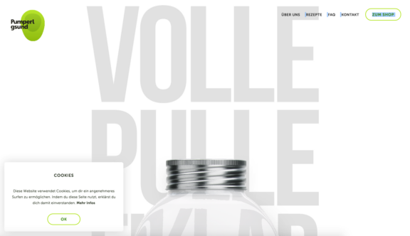
Naturally the page uses a lot of white space, fitting not only to the product itself but also the clean, minimalist look adopted by many fitness brands. The first full screen visual you are presented with is made up purely of large light grey background lettering, which is partially cut off and covered by a screw top jar lid at the bottom of the screen. This is not only beautiful in its minimalism but acts as a prompt that the user should scroll down the page to see more.
As you scroll down the jar begins to shrink and follow you down the page, sometimes showing it’s full brand packaging and sometimes turning clear and flying over the top of more background text. What is really impressive about the jar in its clear state is that the programmers have created the appearance of reflections and refractions in the jar that bend and mould the coloured background text. This amazing attention to detail is easy to miss simply because it is so realistic.
The brand green and orange are brought in as playful accents in various places throughout the page, but one of the most exciting examples of this is where a seemingly gelatinous blob of colour transforms and separates in a similar way to how you’d expect an uncooked egg to move around.
Part way down the page there is also a chicken, which cheekily pokes its head from the side of the page. This is just another of the nice little touches that add to the personality of the brand.
Once you have reached the bottom of the page and taken in all of the product information you are then given some well-presented, easy to digest pricing options, as well as a link to the shop page.
The shop itself is very simple; laying out the four packages nicely and allowing you to easily add or subtract additional items to and from your basket. The price in the bottom right-hand corner updates itself efficiently and draws you to the next step of the checkout process naturally.
Another fantastic feature of the site is the recipe ideas area. Each recipe is listed using a beautiful image overlaid with well-presented titles, nutritional information and how long it takes to prepare.
The recipe search feature is very different to your average search function. To filter results you click to edit words in the search sentence. It starts off as ‘I’m looking for all recipes with all ingredients’, which can then be altered to ‘I’m looking for omelette recipes with carrot’ for example. This does mean it is not as intuitive as more traditional filters and search fields but is somehow quite refreshing.
The recipe detail pages themselves are also nicely presented, wowing you initially with large hero images. One of the most interesting features of the recipes is that the ingredients are presented as images; this really brings an extra bit of life to the page that you don’t often see in a recipe.
There are so many features on this site that make it both beautiful to look at and make for great customer experience but don’t just trust us, see the site for yourself here.
Do you have a site you want us to look at?
Every week, the StrategiQ team are looking for their favourite website of the week – so tweet at us or email us a suffolk@strategiq.co to get featured!
Or, are you a potential client and want our web designers or web developers to have a look at your website? Get in touch!
In the meantime, check out our client case studies!
