Boom Botix – Satisfying Illusion
Boom Botix creates and sells a range of high quality portable speakers predominantly aimed at skaters, bikers and snowboarders to be used as a safer alternative to wearing headphones.
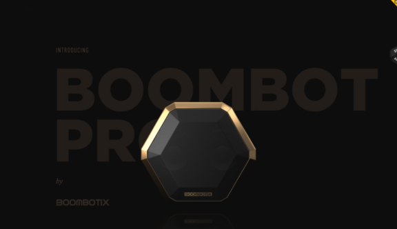
Their latest innovation, the Boombot Pro, has a promotional webpage (held on a subdomain of the main boombotix website) that has caught our eye this week.
The site admittedly gets off to a slightly rocky start as you are presented with a loading screen that is slower than the ideal. However, as the experience loads a Boombot Pro shaped extrusion does appear to grow from out of the plain background, which gives the user some assurance that something more exciting is coming.
Once the screen loads and the Boombot Pro has fully emerged nothing happens until the users clicks or scrolls (and there is no major prompt telling you to do so, so one hopes that most users are inquisitive enough to discover it). The first click creates cracks in the visual and a second click sets off a full screen video that explodes pieces towards, and then off screen, revealing the main page.
Arguably this opening functionality takes a lot of page load time for a fairly short lived result, but you have to admit there is something quite satisfying about the illusion of having smashed something on-screen, especially as you’ve had to work out how to do it with no cues, giving you an added sense of achievement.
The main page itself is packed full of interesting interactions, beautiful full screen visuals and a sense of visual depth created by parallax scrolling.
Parallax scrolling is becoming increasingly popular in web design recently and has been adopted successfully in the case of Boom Botix. The reason it is so successful in this case is because as a promotional page it works to immediately create a sense of interaction and captures the attention of the user, making them want to scroll all the way to the bottom of the page, to make sure there’s nothing they are missing.
The style of the site also lends itself well to parallax, by creating abstract pointed shapes moving over images and text they create a real sense of 3D depth, constantly pulling your eye across multiple points on the page.
To add to the 3D aspect of the page as well as the feeling of constant motion there are a couple of animated images of the product as you move down the page. The user is able to interact with these in varying ways giving the site an enjoyable exploratory element. The interactions include being able move and rotate versions of the product as well as a colour changing feature, showing the various colours the product can be purchased in (the smooth transition between colour changes is particularly satisfying).
There is a small ‘Buy Now’ button that follows you down the page but sits neatly in the bottom right corner. It’s not at all in your face, which is nice as it lets the product speak for itself without seeming pushy. It is quite easy to miss, what with everything else that’s going on as you go down the page, however, there is also a more prominent ‘Buy Now’ section at the bottom of the page with the colour picker, so any interested parties can get to the store with relative ease.
The store site itself is very simple to navigate and filtering and choosing products or finding further product information could not be simpler
As an overall experience the promo page is exciting and bold and leads into a simple to use e-commerce platform; a pleasing user journey indeed.
You can view the website here.
Do you have a site you want us to look at?
Every week, the StrategiQ team are looking for their favourite website of the week – so tweet at us or email us a suffolk@strategiq.co to get featured!
Or, are you a potential client and want our web designers or web developers to have a look at your website? Get in touch!
In the meantime, check out our client case studies!
