Akademie Zubrowka – A Look Inside the Imagination
If you’ve ever seen a Wes Anderson film, you’ll know as an initial on-looker, you’re soon transported into the fragments of this creator’s imagination and into a micro-world of eccentric fantasy, indulgent experiences and total creative freedom until you’re completely absorbed and emotionally invested.
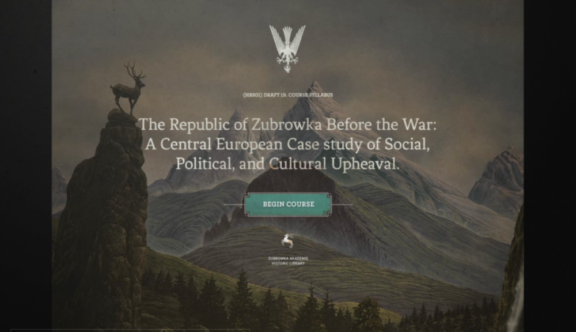
This website was created as a ‘taster’ to the forthcoming film ‘The Grand Budapest Hotel’, offering a window to entice and educate the user through a fictional college course, about the key characters, the alpine fictional world of Zubrowka, and the infamous Renaissance painting featured at the heart of the film.
Upon entering the website through a 1930s-esque postcard animation, you’re immediately transported back to a nostalgic bygone age, a quality that seamlessly flows throughout the website.
The UX design stays true to its chosen era and is based around a vintage microfiche interface, with focusing viewfinder and zoom function, from which digital slides allow you to navigate through the numerous layers of discoverable content, via a digital rotating dial. Executed with such precision, the image treatments, movement and sounds of this interface become integral to the in-depth experience.
The CSS animated transitions are beautiful and fitting to the integrity of both the content and its purpose. The subtle navigation introduced throughout, in particular, the hover-over navigations, tips off the user that something further might be revealed, creating intrigue and a sense of mystery. The more you delve, the more you want to discover – you feel like a character within the film – and through exploration and a little bit of detective work, you become immersed in the story.
Designed and built as a desktop website, and requiring Flash to support its content, this does limit user engagement on other platforms, however, with such heavy animation, video and interactive content, I feel this is a slight compromise to ensure visitors to the site have the best experience possible. The mentality to encourage the user to find ‘the best seat in the house’ in order to fully appreciate the detail and be submerged in Anderson’s world, remains a high priority.
The design elements within the website have two different styles, reflecting pre- and post-war eras. However, when combined, they create the perfect synergy and capture the tone and aesthetic of the film perfectly. On the one hand, the user is presented with whimsical watercolour interface transitions, hand-coloured photography, handwritten notes and video clips from the film, but on the other, there is a definite contrast. Pre-war Eastern European graphical and typographical influences, with distinctive symbols, coupled with clean, precise layouts associated with military documents, reflect the unmistakable totalitarian style of the era that followed peacetime.
I love the journey you experience on this website, and I could easily lose myself in discovering the minute detail that has been crafted so meticulously, which to me, makes this such a success. Like the multi-layered cream cakes made at Mendl’s bakery, this interactive adventure is nothing short of yummy – storytelling genius!
You can visit the Akademie Zubrowka site here.
Do you have a site you want us to look at?
Every week, the StrategiQ team are looking for their favourite website of the week – so tweet at us or email us a suffolk@strategiq.co to get featured!
Or, are you a potential client and want our web designers or web developers to have a look at your website? Get in touch!
In the meantime, check out our client case studies!
