The Metropolitan Opera – Leading the Industry
The New York Metropolitan Opera is well known across the world for it’s cutting-edge contributions to the artistic community, therefore it would only be fitting that its website to be leading the way in web and UX design in their industry.
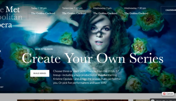
The overall design of the website is very modern, using lots of flat colours and little embellishment other than beautiful show photos. You can see that the company is deliberately making opera more digitally accessible to an audience that is unfamiliar with opera.
On the desktop breakpoint of the website homepage there is a wonderful hero banner slider mechanism, which instead of scrolling left and right on a timer, scrolls up and down before allowing you to move further down the page. This ingeniously means that the user must view all promotional material before scrolling down the homepage further. In principle, it sounds like it could be an irritating feature, but somehow it just works, maybe because it is not an often seen concept or perhaps because the imagery is so beautiful you don’t mind looking at it for a little longer.
On mobile and tablet views the hero banner works in a more traditional left to right scrolling format and information covering the images is kept to a minimum, keeping the simplicity and beauty of the site at the heart of the design.
Going back to the desktop view, there are some lovely hover states created across the site. One of the more powerful examples of this is partway through the ticket purchase process when selecting the area of the theatre you wish to sit in for your selected show. As you hover over each section option (which also handily specifies the price range) a full-screen background image of the theatre lights up to show where the section is.
The user experience of both individual show and season ticket purchases has been well thought through and includes some really nice features. When selecting a specific seat photographic tooltips appear showing the exact view from that seat as well as price and seat number. From this tooltip, you can then choose to select the seat if you are happy.
It’s easy to zoom in and out of the seating map, an also includes a simple price filtering system, taking all the stress out of choosing where to sit.
Season ticket holders have a few options, allowing them to pick and pay for specific multiple shows or a pre-selected series of shows, both saving you a percentage on the overall ticket prices. This is actually a relatively complex process that they have dealt with very well by adding two separate routes with different UX designs tailored to each.
Bringing opera into the digital age is certainly an admirable feat and Met Opera have done a great job at creating an easy to use checkout process that rivals even the more traditionally digital based industries.
You can view the website here.
Do you have a site you want us to look at?
Every week, the StrategiQ team are looking for their favourite website of the week – so tweet at us or email us a suffolk@strategiq.co to get featured!
Or, are you a potential client and want our web designers or web developers to have a look at your website? Get in touch!
In the meantime, check out our client case studies!
