Make It Bright – Impressive & Beautiful
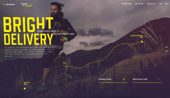
The Make It Bright marketing campaign was created by worldwide sports brand Diadora and revolves around an incredible 1,500km running event whereby 70 runners ran a relay starting in Caerano di San Marco, Italy, carrying one pair of trainers and delivering it to Barcelona, Spain.
Befitting to the magnificent feat of transporting a pair of trainers 1500km by foot, Diadora released an equally impressive and beautiful campaign website.
One of the most striking design aspects of the site are the subtle but charming animations. The more obvious animations across the site include stick men who run across miniaturized map routes as well as featuring on buttons, which add a fun element that helps to pull you into the site.
There are also some more subtle hover animations which add to the overall beauty of the site, in particular the main hero text on the homepage as well as some of the images on other pages rotate around the mouse point when hovered over, giving the page an interesting 3D aspect.
Another design element that adds to the 3D aspect of the homepage is the ever-so-subtle background video; if you look very closely you will notice that some of the blades of grass are blowing in the wind.
The ‘Experience the Run’ page is really where this site comes alive. The delightful navigation through various points in the course is both easy to use and out of the ordinary, using the shape of the route map as a timeline feature of sorts. As you click on various points on the route, the background image transitions smoothly and seamlessly to a new photo, giving the page a feeling of ever-changing dynamicity and helping to show users the multitude of locations that the runners passed through. You are also presented with pop up images at eah point – often including runners wearing Diadora’s sports clothing and carrying the shoe box – as well as snippets of information about the route and fantastically designed feature typography usually stating a runners name alongside their headshot and an image of the trainers they were wearing.
Each point clicked on also updates an informational area featured on the left of the screen, which includes runner’s heart rate BPM’s and the total distance run in steps of all runners up to that point. This is a really nice area with a cool number count up animation, which updates and spins every time a new timeline point is selected.
This very deserving winner of this weeks website of the week, tells the story of the 70 delivery runners beautifully throughout the site in a way that truly entertains the visitor, all the while delicately and indirectly showcasing the Diadora branding and products. A wonderfully vibrant website and the perfect accompaniment to an exciting campaign.
You can view the ‘Make It Bright’ website here.
Do you have a site you want us to look at?
Every week, the StrategiQ team are looking for their favourite website of the week – so tweet at us or email us a suffolk@strategiq.co to get featured!
Or, are you a potential client and want our web designers or web developers to have a look at your website? Get in touch!
In the meantime, check out our client case studies!
