Project Graham – Modern Safety
Public safety campaigners have the difficult task of educating people on things they don’t always want to be educated about. We’ve heard it all before when it comes to road safety, so the Victoria State Government of Australia have come up with a suitably eye-catching campaign and a website to boot.
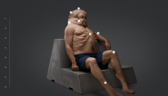
As I was browsing the web looking at the latest and greatest website designs, a screenshot of ‘Project Graham’ instantly caught my attention. The project is based around a 3D model of a man called Graham, but Graham is no normal man, Graham shows us what we might need to look like in order to survive a low impact road accident.
Humans are an inquisitive species so it’s in our nature to want to look at things that are out of the ordinary, so when presented with Graham I was curious to find out more.
The website opens with a large side on version of Graham’s head with a short text intro to the project. You are then given the option to watch an explainer video or to ‘View Graham in 360°’.
In the 360 view you see Graham in his full glory, sitting back and relaxing on his concrete seat. You can spin him around by dragging him with your mouse or using your keyboard arrows.
There are 8 key points across his body that are marked by clickable crosses. Once a point is selected a side menu opens including a video and some concise content explaining how that part of the body has been redesigned to optimise it for a crash as well as highlighting the already brilliant design of the human body.
You are also shown a close up of the selected body part, which when hovered overuses a magnifying effect that allows you to uncover the internal workings of Graham’s body, including bones, muscles, veins and much more.
This functionality is reimagined in terms of layout on mobile but works equally, if not more, seamlessly as on desktop.
As well as the fantastic functionality they have created to allow you to examine Graham there’s a well-designed, straight forward menu that leads you to more information on visiting the exhibit in real life as well as educational materials.
As a website design, Project Graham is nice and modern, with an almost sci-fi feel to it, which works really nicely with the subject matter.
It’s a highly interactive experience and in itself acts as a fantastic tool for teaching children (and adults of all ages) about the human body and the dangers of the road in an enjoyable explorative format as well as gracefully promoting the physical exhibition.
You can view the Project Graham website here.
Do you have a site you want us to look at?
Every week, the StrategiQ team are looking for their favourite website of the week – so tweet at us or email us a suffolk@strategiq.co to get featured!
Or, are you a potential client and want our web designers or web developers to have a look at your website? Get in touch!
In the meantime, check out our client case studies!
