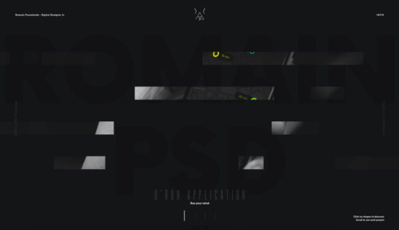
Romain PSD – A Curiosity Inducing Portfolio Website
What better way is there for a digital designer, who’s just getting his career started, to make a splash than by designing an attention-grabbing portfolio website for himself. Romain Passelande has done just that and he’s done it with some serious flair.
Before we get into why this site is so awesome it’s worth mentioning that the site is pretty much completely unusable on mobile or tablet. To begin with, this felt pretty disappointing and ill-thought through, but on second thought it does make some sense. The whole purpose of this site is to showcase Romain’s work and perhaps as his work is best viewed at a larger screen size, the case he is making here is that even if users do want to look at his work on mobile devices it’s not worth doing so as the experience would not be what he wants you to see, so he simply does not allow that as an option.
Personally, I think it would still have been nice if some kind of effort had been put into creating a mobile experience, even if it was a vastly stripped-down and simplified version of the site, but I can see a potential motive behind this so I’ll let this one slide…
Negative points aside, the desktop experience of this site is glorious.
The visual design itself is bold in its minimalism; it’s all about exploring the work with as few written cues as possible.
Navigating the site takes a lot of exploration and is presented in an almost game-like style, with floating blocks revealing parts of a background image that reveal the full image when hovered over. The background image changes periodically and you come to realise that each image relates to a different project and when clicked on will take you to a portfolio page.
Once you have reached an internal project page you will find a series of portfolio page images laid out along with some subtle parallax page scrolling features to keep the feeling of dynamicity.
To supplement this beautiful and exploratory design Romain also includes some very nice micro interactions, mostly in the way of hover effect – something that I feel is instrumental in making this site work as well as it does.
See his site here.
Do you have a site you want us to look at?
Every week, the StrategiQ team are looking for their favourite website of the week – so tweet at us or email us a suffolk@strategiq.co to get featured!
Or, are you a potential client and want our web designers or web developers to have a look at your website? Get in touch!
In the meantime, check out our client case studies!
