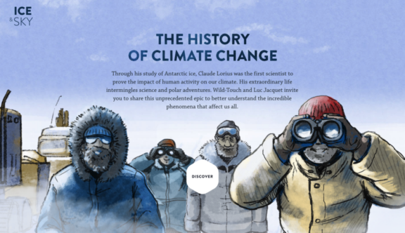
Ice & Sky – An Educational Website on the History of Climate Change
You are first presented with a splash screen, made-up purely of a background video and a ‘Discover’ button. The discover button takes you directly to the main homepage, where you are able to navigate through the rest of the site.
The home screen is comprised of six full-screen background videos; one for each section of the website, each one overlaid with a title and button leading into the relevant section. At the bottom of the screen is a navigation bar, which on the homepage shows the numbers one to six. As the background videos cycle through, the relevant number in the series highlights itself with a hexagonal progress bar, these numbers also change the background video when hovered over and take you to the relevant section when clicked on.
Once a section is selected the navigation flips, using an animation effect that gives the illusion that the navigation bar is a rotating cuboid. After spinning, a new timeline style sub-navigation is revealed, to help guide you through the section.
Each section is made up of a selection of full-screen images and videos, overlaid with text content, downloadable PDFs and playable sound clips. As you scroll down the page the entire screen rotates in a similar style to the navigation, giving the same cube-like appearance.
When you are in one of the sections a menu button is available in the navigation bar. Once pressed the menu flips back to the original one to six set up to allow you to easily jump into another section no matter where you are in the site. As well as the navigation changing, the entire screen transforms to show a series of full height sections, the really nice touch here being that as you mouse over these horizontally the sections move with your mouse, allowing you to scroll through sections in another exciting way.
The style of the website is a mix of flat colours, crisp images and hand-drawn illustrations. As you’d expect from a site named ‘Ice & Sky’ the colour scheme is largely made up of blue and white, which feels very fitting. The navigation features are mostly presented in a bold bright orange that contrasts effectively with the rest of the on-screen elements allowing information discovery through the navigation features simple but enjoyably unconventional.
We love their unique approach to navigation; managing to create something that encourages exploration and feels fun to use, yet still remaining practical and easily learnable. That’s a winner in our eyes!
You can see Ice & Sky’s educational website here.
Do you have a site you want us to look at?
Every week, the StrategiQ team are looking for their favourite website of the week – so tweet at us or email us a suffolk@strategiq.co to get featured!
Or, are you a potential client and want our web designers or web developers to have a look at your website? Get in touch!
In the meantime, check out our client case studies!
