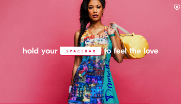
Lovefila.com – Bright & Colourful
Love fila is a well known brand across the world, for producing tennis equipment designed by Marion Bartoli, a French designer, who earlier on in her life earned the title of 2013 Wimbledon champion.
The overall design of the website as a whole, is very bright, and colourful. The company is aggressively trying to sell people their products, by presenting them in a wacky, fun way!
The site gets off to a good start immediately, engaging the user by asking them to hold their spacebar to start an introduction video.
The introduction video, is roughly 30 seconds, presenting their products, with bright colours, different animations, emerging from all angles of the screen, making the user intrigued to watch on.
After the introduction video, the screen comes onto a home page, at which point their products are listed, and accessible to click on and view. I really like this page because again, it is colourful, but it gives you access to view their products, with beautiful show photos of the product itself. The photos are also listed with text, that describes the item of clothing, and gives you an option to click on a different image, which also automatically rotates through the different variations. What’s also nice, is that before the product images change, you are presented with a timer effect, which shows you how long you have before the image changes.
Also on the homepage, towards the bottom of the screen there’s a scroll icon which prompts you to scroll down the page; this ensures that the users will see the whole range of products. Unlike some websites, they have made it clear that the page goes on, so the user doesn’t miss anything on that page.
Going back to the introduction video, at the start, I noticed that as soon as you open the page, background music is immediately played, without an option button, enabling you to turn the music down/off, before it playing. This may not be suitable if in quiet locations. To conclude, I think that the only downfall of this website would be this, and I think that the only thing needed to be changed, is to have an icon, before the animation starts, to disable the music/turn it down.
As an overall experience of looking at this page, I think that it is exciting, bold, and will definitely intrigue potential buyers looking on the website.
You can view the website here.
Do you have a site you want us to look at?
Every week, the StrategiQ team are looking for their favourite website of the week – so tweet at us or email us a suffolk@strategiq.co to get featured!
Or, are you a potential client and want our web designers or web developers to have a look at your website? Get in touch!
In the meantime, check out our client case studies!
