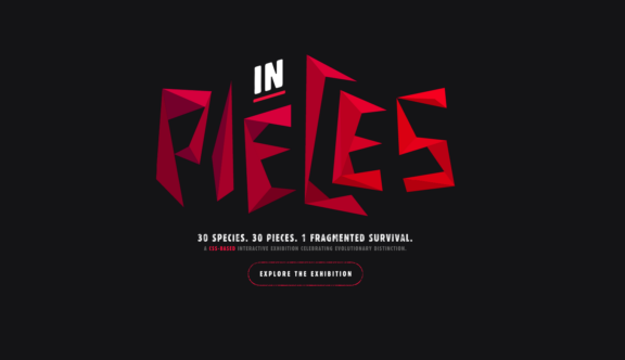
This week’s winner is a digital exhibition named ‘In Pieces’.
‘In Pieces’ is an interactive study of 30 interesting endangered species from around the globe.
You are greeted with a loading screen, which cleverly transitions into an explanatory introduction piece. Through a few short sentences you come to quickly understand the metaphorical meaning behind the set of coloured ‘shards’ which form the basis of the exhibition’s style; the metaphor being that the species you are about to learn about are in pieces.
Once you leave the introductory screen the animated shards of colour fly around and form themselves into the first animal – a helmeted hornbill. Each animal, although made up of these coloured shards appears to come alive as various pieces move to give the impression of a living breathing origami-like organism.
As you scroll using either the clickable arrows or your mouse scroll the shards of colour then form themselves into a new animal, shifting through all 30 species in a continuous loop.
If the beauty of these pieced-together animals wasn’t enough, there are options to read information and view statistics about each species and it’s endangerment. Although the site has no official ties with any conservationist groups the creator, Bryan James, has chosen an organisation for each animal to link out to, hopefully helping to raise some additional awareness.
Being more of an artistic piece, some of the navigation is non-intuitive and has to be learned as you go. For example, there is a pie chart icon used to take you to a set of beautifully presented graphs and figures. However, until you have clicked on this it’s not immediately clear that you are going to be viewing statistics. On most websites the lack of obvious button labelling would probably be considered a poor user experience, however, in this case, it seems to work quite nicely as it encourages the user to take a more exploratory approach through the website, making us rethink what we know about how a website should or shouldn’t work.
This site is quite different to a lot of other sites we look at on a regular basis, as its primary focus is more on impressive visual aesthetic and mesmerising animation techniques than driving users to a specific conversion point.
It is as much an exploration into endangered species and into the wondrous possibilities of CSS animation.
You can view the website here.
Do you have a site you want us to look at?
Every week, the StrategiQ team are looking for their favourite website of the week – so tweet at us or email us a suffolk@strategiq.co to get featured!
Or, are you a potential client and want our web designers or web developers to have a look at your website? Get in touch!
In the meantime, check out our client case studies!
