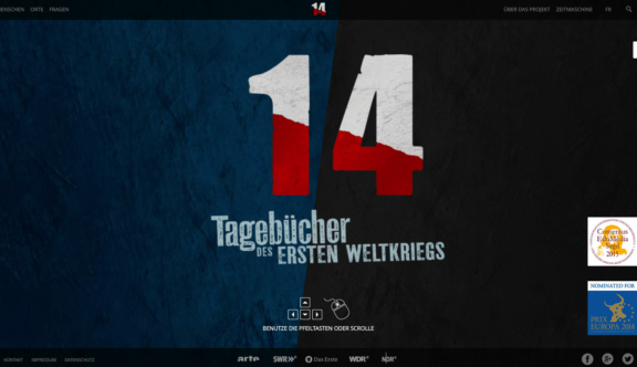
This week’s winner is ‘14 Tagebücher des Ersten Weltkriegs’, a website for a German TV series which translates to mean ’14 Diaries of the First World War’.
The website is a promotional aid to the German TV series of the same name and is based on real diaries from ordinary people from the First World War.
14 Tagebücher des Ersten Weltkriegs – A Striking Design
The homepage is incredibly striking; meeting you initially with a large full-page title on top of a gritty textured blue and black, split background. Importantly, you are also given instructions to use the arrow keys or mouse scroll to move down the page.
With each scroll the screen snaps to the next full screen section of the page, each section fitting responsively to the size of your screen to ensure all desktop users see the same effect. The page is made up of 15 sections, firstly the title area mentioned above, then a section for each character in the TV series. For each character you are given their name, a quote (presumably from their diary) and a ‘My Story’ button.
The most visually impactful component of each homepage section is the large half-and-half photo of the character. The left side of the image is the actor and the right side is a photo of the real person, each of which is covered with a graphic dot style, which helps to keep the sections looking consistent by tying the old photographs together.
Another nice visual aspect of the page is how the scroll transitions through the sections. As you move down the page the left half of the image slides up and the right side slides down, making the page feel dynamic and giving the impression of a sort of revolving motion.
Once you move through to the ‘My Story’ page for each character you find a timeline, just as strongly presented as the homepage. The gritty background texture carries through to these pages, pulling everything together really nicely.
The timeline itself is seamless; it can either be navigated by simply scrolling the page, or clicking through points on a sticky timeline placed at the top of the screen.
There are some nice animated elements to the timeline, such as a fixed background image that content moves over, timeline images and points appearing to move in from the side of the page and a header area that neatly shrinks down and moves around as you move down the page.
One of the most successful aspects of this page is that there is a clear way to navigate to the next character timeline, which can either be done by clicking on left and right arrows when at the top of the page or by selecting a character’s face in a grid of images, which appears in the header once you have scrolled down.
The rest of the site contains large amounts of information both about the First World War and the project itself and these pages all follow a fairly simple structure, which presents the information clearly and is easily navigable.
As well as this project as a whole being greatly interesting, the website is a fantastic body of work in itself; making you actively want to learn more and forcing you to really buy into the project.
You can view the website here.
Do you have a site you want us to look at?
Every week, the StrategiQ team are looking for their favourite website of the week – so tweet at us or email us a suffolk@strategiq.co to get featured!
Or, are you a potential client and want our web designers or web developers to have a look at your website? Get in touch!
In the meantime, check out our client case studies!
