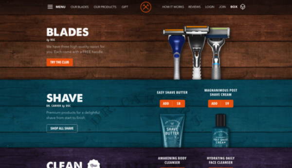
Dollar Shave Club – A Lovely Hint of Vintage
As a whole the website has a lovely hint-of-vintage style, showcasing products mostly on wood panel backgrounds. One of the best looking pages on the site is the product page, which showcases each of the products and their separate sub-brands simply and stylishly. The calls to action are consistent and just the right amount noticeable without being too pushy or in your face.
The site is nice and easy to navigate, making understanding the service and it’s products simple. It does take a little longer than you’d like to work out exactly how the service works though. For those that don’t already know the business, it’s a regular delivery of shaving products that can be personalised to each persons shaving preferences and frequency – a sort of Graze box for shaving. The video in the homepage hero area is fantastically amusing and also great at explaining how the company works, however this does rely on users pressing play, which often people will not. It’s obvious immediately that this is a place where you can order shaving goods online and the packaging example on the homepage does a good job of showing you the type of thing you will be receiving, but it would be great if it was more immediately obvious how customisable the service is.
Possibly the greatest asset to the website is the playful brand voice that is created through both the design style and copy. The content is confident and amusingly cocksure in places – for example ‘By now you’re probably convinced of the wisdom of joining the club’ appearing at the bottom of the How we do It page or ‘EASY CANCEL. Seriously, we should make it harder.’ This self-assured style of writing, along with other playful graphical elements, is not only entertaining but also acts to instill confidence in the customer.
Another of the ways in which Dollar Shave Club promotes trust in their brand is by using a good reviewing system. They essentially have two methods of review, one for those who want to review via social media and one for those reviewing products on-site. Each works equally well to market the company as a reputable business, something that is important for a company of this kind as it’s service is outside of the norm and challenges customers usual shopping habits.
The social media reviews work well in that they not only provide the website with reviews that they can use to promote themselves, but they obviously also help to spread the word outside across social media.
The on-site product reviews are equally valuable and use an attractive starring system which seems to add an authority and authenticity to the reviews.
The pricing table on the ‘Our Blades’ page is really nice from a UX perspective. The prices of each blade are clearly printed at the top of each column, accompanied closely by star ratings to back up why the marginally more expensive razors are such. There’s also a stamp claiming the most expensive option as the ‘members favourite’, to help reinforce that buying the most expensive razor is the right choice. The option to select the blade comes very high up in the pricing tables, before you even get the chance to see what you will get with each blade, making it really easy for the user to start adding things to their box (their name for shopping basket). For users who aren’t quite ready to add items to their box there is the option to learn more about each blade on it’s own separate page, each of which also successfully shows CTAs.
Another element of the pricing page that’s a really nice touch is the sliding button, which allows you to switch from a view of the blade pricing table to the bundles pricing table. It’s great that these are presented as two separate pricing tables, as this information would be a little overwhelming if presented on one page, plus the switch itself is also satisfylingly designed in keeping with the wooden panel motif. The only slight problem, caused primarily by the fact the pricing tables are so well designed to bring your attention towards the CTA, it is quite easy to miss the second pricing table, however, there are so many routes through the site which lead you to view various products and bundles that this most likely isn’t a huge deal.
It is fantastic to see a website which uses high quality product images and textured backgrounds, which work seamlessly across all breakpoints. The mobile breakpoint looks just as good (if not better) than the desktop and is super easy to navigate, making this the righteous winner of this weeks website of the week!
You can view the Dollar Shave Club website here.
Do you have a site you want us to look at?
Every week, the StrategiQ team are looking for their favourite website of the week – so tweet at us or email us a suffolk@strategiq.co to get featured!
Or, are you a potential client and want our web designers or web developers to have a look at your website? Get in touch!
In the meantime, check out our client case studies!
