Optimo Hats – A Custom Hat Maker Based in Chicago
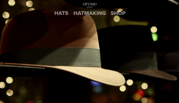
You are greeted on the homepage of the Optimo site with a fashionable full screen, close-up video of a row of hats with night-time traffic passing by in the far background. Other than the video, the homepage is made up purely of the navigational header. Stripping back any sales-y clutter from the homepage and leaving visitors with the bare essentials is a confident tactic, which in this case pays off. The video and main navigational elements give you everything you need to understand what the company does in less than 5 seconds.
The navigation is one of the highlights both in terms of usability and style, including some sensational micro-interactions that are very successfully translated through all responsive breakpoints. The cascading effect seen when clicking on the dropdown menus is fantastic on both desktop and mobile.
If there was one criticism of the navigation it would be that on some of the light grey internal page backgrounds, the white text is somewhat lost unless hovered over. For an industry that presumably caters for a large amount of older users it seems that accessibility should be more of a priority, even if the primary audience of the website is younger.
Another great feature is the collection page, which uses a grid of hat images showing all of Optimo’s available products. Each time your cursor moves over a hat image it tips slightly to the side and reveals the name of the hat. It’s that kind of titillating detail that makes you want to linger on the page and browse the collection – great for customer engagement.
The hat images themselves are elegantly presented and meticulously uniform in style. This carries through to the hat detail pages where there is a full screen slider image showing ‘floating’ versions of the hat at various different angles.
If we are being picky, one aspect of these product pages (as well as a handful of others) that Optimo doesn’t seem to have fully refined, is the typography. A large amount of the body text is presented in all caps making it challenging to read, additionally some of the other typesetting and feature typography feels a little clunky and unconsidered in places. Overall, it’s not a huge problem as there isn’t a massive amount of text onsite, but it would be lovely if the type was as well constructed as the rest of the website appears to be.
Other than a few product related pages, a large majority of the site is made of full screen explanatory videos. The videos are all beautifully shot, well edited and informative.
As nice as the videos are, it could be more user-friendly to include some written information, due to the fact it’s not always convenient for the user to watch a video. Arguably they do have links on each video to relevant newsletter pages, however, the newsletter is designed in a completely different style to the main site and feels slightly disconnected. It seems to take away slightly from the sophisticated image created at the core of the website.
Another downside to having gorgeous high res images and large full screen videos all over the place is that at times the page load speed can be a little slower than you’d hope. This doesn’t feel like a major issue though, and for any wait times you may experience on this website, it is generally worth the wait.
Overall the Optimo website pulls together a well blended mix of traditional style and magnificent up-to-the-minute web design incredibly well. Despite some very minor criticisms, this really is an exquisite website, worth aspiring to.
You can view Optimo’s website here.
Do you have a site you want us to look at?
Every week, the StrategiQ team are looking for their favourite website of the week – so tweet at us or email us a suffolk@strategiq.co to get featured!
Or, are you a potential client and want our web designers or web developers to have a look at your website? Get in touch!
In the meantime, check out our client case studies!


