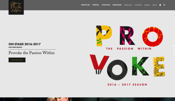
Opera Philadelphia – Sophisticated Yet Modern
I was so pleased to find this week’s website winner, the Opera Philadelphia, it has so many plus’s and I will find it hard to detail all of them, however, I will do my best to be concise as always. Beginning with the colour palette, the muted natural shades of brown and gold suggesting age, class and are very befitting to the classic subject matter. The branding is playful yet sophisticated and modern, blending in with the colour theme.
One of the big challenges for the designers of the site is the large number of pages, the navigation is really well thought out; its resulted in a really considered user journey. I especially liked the ‘What’s On’ drop down option. The way they have differentiated the events using colour as you hover and the beautiful typography and layout is definitely bookmarked in my browser.
You get a real sense of quality here, tastefulness and elegance as you step through the site. The detail in the iconography, even the buy your ‘Ticket’ button is a minimal serrated ticket. At no point did I wonder where I was, or feel overwhelmed by too much content. The booking stages are very clear, the interactive theatre seating plan is clear and minimal, showing you the cost of the ticket as you hover over the seat.
I have booked online for theatre shows big and small, my experience with these is that you feel part of a big machine, rushed through, never quite enough information and you end up phoning them direct out of frustration. Here you find lots of well presented information including videos, press releases, audio SoundCloud clips, all of which are well set teasers that make you want to go and see the performance.
This may look like a simple site, but knowing what would have gone into this to get it to work and look the way it does would have took some very measured and considered planning from the creative team. This is a brilliant example that other theatre operators should follow.
One of the mission statements on the website states “Opera Philadelphia is committed to embracing innovation and developing opera for the 21st century” I believe this message comes through very clearly throughout this innovative and engaging site.
You can visit the Opera Philadelphia site here.
Do you have a site you want us to look at?
Every week, the StrategiQ team are looking for their favourite website of the week – so tweet at us or email us a suffolk@strategiq.co to get featured!
Or, are you a potential client and want our web designers or web developers to have a look at your website? Get in touch!
In the meantime, check out our client case studies!
