ASSOS – Keeping Visitors Engaged
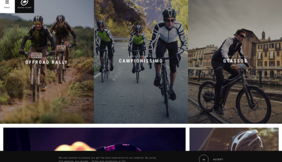
ASSOS are creators of specialised cycling apparel for mountain bike professionals. This website really demonstrates that you can pack in lots of content, both image and text and still keep your visitor engaged, not having access to their analytics, I would be confident in saying their visitors time onsite is very high and the content shared is also high.
So the question is how have they done this? There are a number of really good examples on this site to follow, such as the landing page, what appears at the top of the page is latest news, therefore this is what they want to lead with – this makes good sense as they are a brand that supports mountain bike racing across the world, the stars performing well in these races are wearing their brand, therefore they want to showcase the strength in their brand at these top events.
Another important element to what makes this site look so good is that the photographs are shot beautifully almost Formula One, Vogue like style, they have been shot and retouched by a sports photographer and this again makes us feel like we are dealing with a quality brand, it really matters to them how there clothing appears on the site, it has to look its absolute best.
The consistency of the quality of both photography layout, content and video is on point throughout the entirety of the site. This again is important to them, they are a precision tech clothing company and that precision needs to be reflected in the brand and website.
The interactivity such as hover states are simple and elegant with slow zoom in hovers on the images, a good example of a burger menu that has small amounts of effects on hover and click states.
It has good social links and the videos are short and interesting. They have stores around the world, the stores themselves look very cool with monochrome colours and minimal fitted rails like what you would expect from a couture clothing designers store, certainly not your typical sports clothing retailer JJB, Sports Direct etc.
This website ticks all the boxes, and is top of the class for me, it fits the changes we expected to see for 2016 and I think a tough one to beat. Just brilliant.
You can view the ASSOS website here.
Do you have a site you want us to look at?
Every week, the StrategiQ team are looking for their favourite website of the week – so tweet at us or email us a suffolk@strategiq.co to get featured!
Or, are you a potential client and want our web designers or web developers to have a look at your website? Get in touch!
In the meantime, check out our client case studies!
