STADIUM TECHCENTER – Showcase Excellence
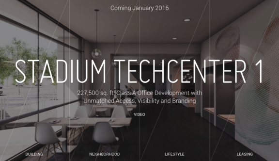
This week’s web award goes to the excellent Stadium Tech Center website. The site was selected for being a great example of how to showcase and sell. In this case, the website is showcasing real estate to lease in Silicon Valley.
Upon load of the page, users are presented with a black backdrop and an overlaying white pulsing shape that eventually subsides to reveal the available property. The well-placed overlaying font adds to what is a pleasant transition and an excellent way for the site to reveal itself.
The site makes excellent use of video, all of which are beautifully shot which really nullifies the need for voiceovers. This essentially places the properties in the foreground, allowing them to effectively ‘sell themselves’.
When you select the ‘Leasing’ option, you are lead to a simple list of four emails and contact numbers. There is no contact form on the page, which places emphasis on the quiet calls to action, which again puts considerable weight onto the properties in question.
This is clearly a high-end product and this shows with the care taken in presenting it in this way. What works really well here is that it’s not repeating itself or shouting out – it is a classy marketing window and quietly understated.
Overall an excellently presented website that proudly displays its content through a number of key mediums in a sophisticated manner.
To view the Stadium Tech Center website, click here.
Do you have a site you want us to look at?
Every week, the StrategiQ team are looking for their favourite website of the week – so tweet at us or email us a suffolk@strategiq.co to get featured!
Or, are you a potential client and want our web designers or web developers to have a look at your website? Get in touch!
In the meantime, check out our client case studies!
