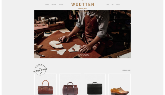
When something oozes quality, craft, soul and meticulous attention to detail, you’re instantly warmed and drawn to it. Wootten.com.au is a website to promote the craftsmanship and the story behind the shoemakers in a suburb just outside Melbourne, Australia, and their ability to adapt with the changes within an industry, which has seen real highs and lows, particularly within the last 30 years.
There is a real honesty not only in the beauty of the photography but in the story itself, and the phrase ‘what you see is what you get’ couldn’t be more appropriate.
Where Design Reflects Craft
The layout and design of the website is testament to the ‘nature of the beast’ and Woottens philosophy – creating sustainable design (not in the environmental sense) by looking at ‘slow fashion’ through practical adaptation of timeless forms, which they’ve translated from product to website. Its classic artisan appeal will undoubtedly weather current hipster trends, as it directly echoes the history of the craft.
When landing on the homepage, in addition to the beautiful photography, there is an option to take a peek ‘behind the scenes‘ via a short, well executed film, which helps to tell the story of how these wonderful pieces of ‘art’ are fabricated. The intimacy that is captured, supported by warm, moody lighting, allows the viewer to feel as though they are part of a masterclass, gaining insight and knowledge of something very bespoke, treasured and skilled.
Simple overlaying graphics and iconography highlight key tools and processes used, with the same stylistic approach peppered throughout other areas of the website. The music creates a nostalgic outback, bluegrass vibe which is very fitting to the subject matter.
Sympathetic Style
The selected typeface used for the headline titles hark back to the traditional signage seen outside local craft workshops, with a parallel drawn to the branding of livestock and leather, particularly with the introduction of earthy tones within the colour palette.
The logo, which also uses the same typeface, has the feeling of a traditional maker’s mark, again emphasising the importance and pride felt in the heritage of not only the family-run business, but the art of traditional leather work, particularly cordwainery.
The supporting monospaced typeface is another detail that alludes to the precision and measured design decisions in both handcrafted and digital elements, complementing both historical influences, such as the typewriter, and its modern-day counterpart the computer, as well as the source code used to create the website.
Elegant Interface
There are barely any frills or fancy user interfaces. Whilst, in my view, parallax has been overused in so many instances recently, I feel that because it is used sparingly, in this case it is validated to enhance the depth and storytelling within the process and heritage pages.
The use of an automated carousel allows the user to go further along the journey, and the numbered diamond indicators mirror the clean stripped back design, and could be interpreted as a modern leather symbol. Simple but effective hover-over status indicators clearly direct the user to their chosen destination and the traditional top-menu navigation provides a comforting familiarity.
The e-commerce area is easy to use with simple filters and the constant placement of the ‘cart’ indicator to the top right of the website, which enables the user to keep track of their order no matter which page they venture onto.
Enhancing the User Experience
The photography of the products remains true to Wootten’s ethos, classically shot and transposed onto a minimal light grey background to avoid fuss. However, the lack of a zoom function or detailed photo for each item in their respective colourways lets this area down – you are more removed from seeing the quality and detail that is so lovingly applied to each piece.
Whilst I appreciate that this area needs to appeal commercially to the audience and provide clear, sharp photography of all the items, I feel that the sensorial experience (where you could almost smell the leather and waxes from the more ‘environmental’ shots) within other areas of the website, is lost. A few simple macro shots to see the detail of the leather, stitching and brasswork would have sufficed to maintain this.
Nevertheless, the overall experience of Wootten’s website is strong and a real pleasure to navigate around. The feeling in their workshop is that if the shoe reflects the owner’s personality and is honest in its design, it will be looked after and will have a much greater lifespan. I would like to believe that their website will do exactly the same and wish them many more years of success.
Do you have a site you want us to look at?
Every week, the StrategiQ team are looking for their favourite website of the week – so tweet at us or email us a suffolk@strategiq.co to get featured!
Or, are you a potential client and want our web designers or web developers to have a look at your website? Get in touch!
In the meantime, check out our client case studies!
