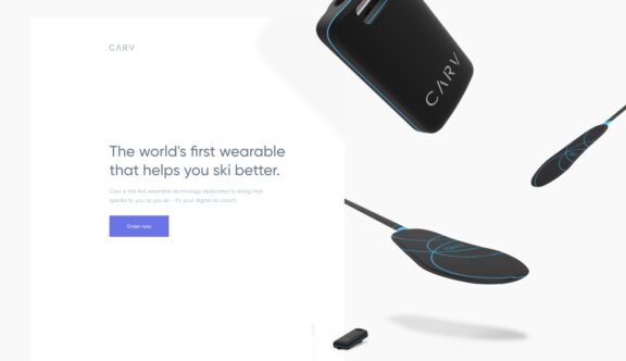
After creating a Kickstarter project earlier this year and smashing their target within the first two weeks of launching, Carv has now created a website as slick as its product to promote and sell this nifty piece of skiing technology.
What Does Carv Do?
Carv is an insole compatible with all ski boots which tracks, collects and feeds back to you in real-time via an app on your phone, detailing your technical progress and giving you the experience of having a personal tutor in your pocket.
It collates and analyses data on your achievements, personal best runs and enables challenges with friends to find out who’s the best skier. It’s a very funky piece of kit!
Cutting a Dash
There’s no messing about with this site either. When you land on the homepage, a short, concise call to action is immediately followed by an ‘Order Now’ button. When you hover over the order button, the blue background changes to a darker blue in a swiping motion – a recurring transition used throughout the website, and a nice reference to the movement of snow when it’s carved from the mountainside by skis.
A very simple lightbox form pops up after choosing to order, which makes the order process incredibly easy and cleverly remembers your input details should you accidentally click off the form.
As you scroll down the parallax website, the overlaying assets smoothly and subtly change in width and direction in a timed layering effect, mimicking the technique of a fluid skiing action and the subtle changes a skier would make to reach optimum performance.
The weightless movement of the graphics infer the lightweight materials used and the slenderness of the product, which allows the user to focus on improving their technique.
A Smooth Journey
Once the viewer has scrolled below the fold, a basket icon is clearly displayed in the top right corner, allowing quick access for a purchase to be made at any point along the user journey.
A short promotional video accessed via an embedded iframe, allows the user to see the product in use. It demonstrates an overview as to how the app works and the benefits of the product, incorporating motion tracked text and animated graphics (similar to those used in the app) to overlay action shots. The key feature within this video is the testimonials from well known sportspersons and key industry spokespersons, which instantly gives the product significant credibility and instills confidence to potential purchasers, thus increasing the chances of sale conversions.
The user journey of the website is designed to reflect the journey of a skier, travelling from the top and sweeping down to the bottom, with the content and visuals interchanging from one side to the other. There is time to take in the view midway down with use of a fabulous photograph, with parallax qualities and overlaying key message, to catch your breath from the sales and tech benefits, before setting off again and revealing the key features of the product.
If Looks Could Carv
I really like the aesthetic treatment the website’s been given. Its light colour background with complimentary blue and grey palette is reflective of the outdoor alpine environment and the clean rounded sans serif typeface is easy to read and fitting to the modern product.
Combining that with the hand-drawn prototype diagrams, 3D rendered product visuals and app screenshot mockups, it gives the overall website an engineering feel, fitting for technological newcomers and potential leaders within the field.
The subtle animated indicators situated next to the smartphone mockups are a nice touch and rather than detracting from the app visuals, actually enhance the user experience, informing them that further visuals will automatically interchange on the mobile screen. The ability to toggle between the three different app screenshots gives the user extra flexibility to choose which they wish to view, without having to wait for the automated carousel.
Two small video excerpts, incorporating the smart motion tracking graphics, are re-used as the user navigates down the page, encouraging those who may not have seen the video to view it and investigate the product further. The promotional video is their best selling tool and maximising its appearance is essential and will no doubt be testament to the product’s success.
Like its product, Carv’s website is simple to navigate, streamlined, intuitive and well designed to boot.
Do you have a site you want us to look at?
Every week, the StrategiQ team are looking for their favourite website of the week – so tweet at us or email us a suffolk@strategiq.co to get featured!
Or, are you a potential client and want our web designers or web developers to have a look at your website? Get in touch!
In the meantime, check out our client case studies!
