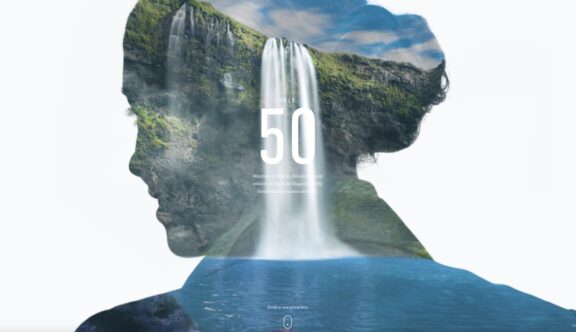
iFLY – Celebrating KLM Magazine
iFly 50 is a microsite created to celebrate the 50th edition of iFLY KLM magazine, a digital publication which finds the latest hotspots around the world for like-minded flyers who love the finer things in life, and provides inspirational stories via newsletters.
Reaching 10 million readers in more than 40 countries, it’s a customer retention tool that builds a relationship and loyalty with KLM – exciting passengers and providing them with the inspiration and reason to choose KLM the next time they fly. The marketing tool, which is fully responsive and works across all digital platforms, promotes the top 50 most mesmerising and sometimes undiscovered destinations in the world, creating the ultimate travel collection.
An Inclusive User Experience
The landing page welcomes the user with a short, striking double exposed film, and a voiceover introduces ‘50 breathtaking reasons to travel’. Relaxing, contemporary instrumental music, completes the sensory experience without being overbearing; however, should the visitor wish to peruse the site in peace and quiet, there is a discreet button to mute the music at any point within their experience. A simple animated indicator prompts the user to navigate into the main area of the website, whilst a fly-up menu option in the bottom right corner, allows the user to select one of four other languages, targeting a much wider number of potential customers and catering for a worldwide audience.
As the user scrolls, the number 50 which sits centrally to the screen, animates with an upward scroll, masking part of the first location in a window-like manner, giving the user a momentary glimpse to where they are heading. This is swiftly followed by a smooth, sweeping parallax effect, taking the viewer into the main area of the website, with a subtle transition sound effect to enhance the feeling of being effortlessly transported to the next destination.
I love the minute attention to detail from both a styling and timing perspective during the transition from one location to the next. To the left-hand side, a sleek straight line shows the direction of travel, before morphing itself into the country of choice. A large, inviting sub-caption describes for the viewer what the photograph is portraying, and a solid, animated circle cleverly attracts the attention of the user, before immediately transforming into a stylised, wireframe ‘read more’ button, in keeping with the overall aesthetic.
Design Meets Functionality
It would have been easy to design the important navigation buttons in a lighter weight, allowing the photograph to remain the focal point, at the risk of the navigation being overlooked by the viewer. However, the designers have demonstrated foresight and a practical mindset through thorough UX research, thus encouraging a higher click-through rate for users to discover more about the locations and the KLM website link.
Once the ‘read more’ navigation is selected, another sub-heading and short paragraph reveal more about the location, with Twitter and Facebook links to share the experience with friends and family. More importantly, a direct CTA encourages the potential customer to find their trip via a link specific to each destination on the KLM website, opening a new booking window. This includes flight, accommodation, hotspot areas, practical information and special offers to entice the user to make a serious enquiry.
Subtle, interactive hover-over CTAs sit centrally towards the bottom of the screen to accentuate a navigation command, again educating the user as to where they may find the information to discover more about each of the locations. Should the user not see this navigation immediately, the command automatically changes after 3 seconds, to once again grab the attention of the user and encourage them to explore the next layer of the selected destination – giving them the ability to view more photographs, short video profiles and audio extracts.
The user can ascertain at any point which numbered location in the top 50 they are visiting, with a counter in the bottom right-hand corner to prompt them. Should they wish to view all the destinations and skip to a specific location without having to scroll through 20 or so, a gallery view is accessible in the top right corner. This in itself is beautifully designed and simple to navigate, with a refined hover-over status revealing each location and subtle prompts in sound to indicate a change in selection.
Engaging the User
The integration of a competition is a key way of engaging the audience further, and encourages potential customers to sign up by completing a few simple fields. The chance to win two tickets to a destination of your choice, simply by liking “5 favourite destinations”, seems very appealing. Clicking a wireframe heart icon, turns the selected favourite destination into a solid shape, and a voice over confirms each of the selections with a different message. Once the five destinations have been finalised, a full-screen prompt asks the user to review and ensure they are happy with their choice, before submitting them for a chance to win.
KLM’s microsite does more than simply promote offers, competition incentives and push sales, it acts as a constant source of inspiration that engages and builds an emotional connection with their passengers. The site echoes KLM’s overarching strategy to allow a ‘journey of inspiration’ to each of its customers.
With stunning full-screen photography, video work and audioscapes layered with perfectly executed transitions and subtlety in its navigational approach, this is a compelling interactive storytelling experience, and has become one of my favourite immersive and experiential websites. A breath of fresh air!
Do you have a site you want us to look at?
Every week, the StrategiQ team are looking for their favourite website of the week – so tweet at us or email us a suffolk@strategiq.co to get featured!
Or, are you a potential client and want our web designers or web developers to have a look at your website? Get in touch!
In the meantime, check out our client case studies!
