Locus Solus
This week’s winner is the website for Locus Solus, a range of furniture originally created by Italian designer Gae Aulenti in 1964. The collection is now being revived by EXETA along with a gorgeous promo site that really caught my eye.
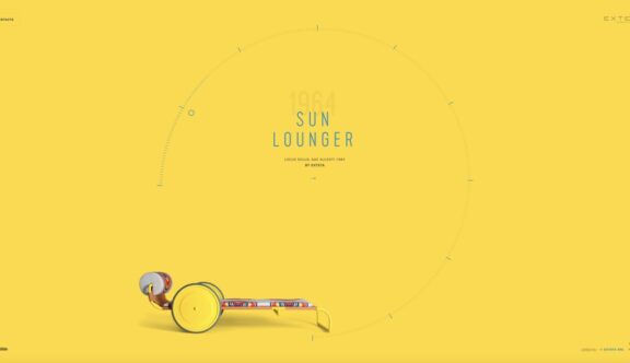
The furniture itself is most notably characterised by its bright colours and patterns exploring ‘the expressive potential of colour applied to metal and to cloth’. The distinctive style has been carried through to the site by using an exact colour match of the furniture frames for the full screen backgrounds and by using animated circular page transitions to reflect the cloth patterns.
The strong use of bold, flat colour manages to create a nice balance between the iconic 60s style and a more minimalist modern feel.
Keeping it Simple
The homepage simply presents each product on a rotating carousel which begins with a large image of Gae Aulenti herself and a link to the ‘About’ section. The progress bar showing the time between each carousel page is striking, encircling the main page content and acting as both a feature and a frame to focus your attention on the title, product image and links to product detail pages.
As the progress bar moves to each new slide the whole structure ripples, which seems to be a clever nod towards the fact that this is a range of garden furniture, largely used around swimming pools.
Consistent Minimalism
Once you navigate onto a product page you are once again presented with a bright background with a solitary product image and it’s title. One of my favourite little touches is the small, animated line that flows from near the bottom of the page and disappears off screen. It’s one of the subtlest page scroll prompts I’ve come across and it works incredibly well due to the fact the rest of the page is so minimal.
As you scroll down a product page the background colour switches, showing you the product in it’s various colours on the same colour background. This style of almost camouflaging the product images against an identical background colour is somewhat counter-intuitive, but somehow very effective and makes for an exciting way of showcasing the colour variations available.
A Smooth User Experience
The site is filled with understated micro-interactions, coupled with exquisite page transitions and mega quick load times, making the overall experience feel delightfully smooth. This attention to detail has allowed the site to remain incredibly product focused without appearing too sales-y, simply by making the website a piece of art in its own right.
The site is a fantastic example of a design that’s so meticulously thought through that it creates a flawlessly simple showcase of the bare essentials. There’s a lot to love about this site and we’ve only scratched the surface, you can see the site for yourself here – www.locus-solus.it.
Do you have a site you want us to look at?
Every week, the StrategiQ team are looking for their favourite website of the week – so tweet at us or email us a suffolk@strategiq.co to get featured!
Or, are you a potential client and want our web designers or web developers to have a look at your website? Get in touch!
In the meantime, check out our client case studies!
