Design Conference – Graphically Interesting & Beautiful
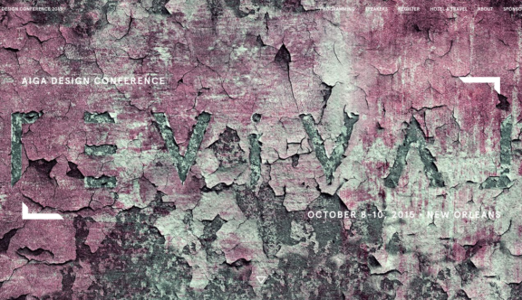
The AIGA ‘American Institute of Graphic Arts’ have built this site to market the 2015 conference being held in New Orleans in October, this has been selected as a winner this week as it is a fine example of keeping information simple, effective and doing the job it set out to do – ‘Market an Event’.
Firstly, the landing page image is graphically interesting and quietly jumping up and down is an arrow to guide you to scroll down to read the headline below the fold, scrolling further you watch the short video which is shot, edited and colourised beautifully.
The typography is strong and elegant and the transitions as you scroll smooth and not at all distracting, this is a long landing page but because this has so much interesting imagery and not too much-written content you want to keep reading, I forgive the fact that the sticky header gets lost on the white background for a moment, but the fact is a novice web user would not be looking at this site if they are not interested in design, this site suits its intended audience.
All of the information is there and easy to access, the navigation is not fussy, I like the dark gradient transition when you hover. The site has a clean look and feel, the colour palette has subtle and neutral colours. All the photography is great including the photos of the speakers, which can sometimes be hit and miss in terms of continuity.
As an admirer of pure design this is a worthy winner, a site truly built in the context it was meant for.
To view the Design Conference website, click here.
Do you have a site you want us to look at?
Every week, the StrategiQ team are looking for their favourite website of the week – so tweet at us or email us a suffolk@strategiq.co to get featured!
Or, are you a potential client and want our web designers or web developers to have a look at your website? Get in touch!
In the meantime, check out our client case studies!
