Every Monday, the StrategiQ Team make their picks as to their top 5 favourite websites of the week.
And the winners are…
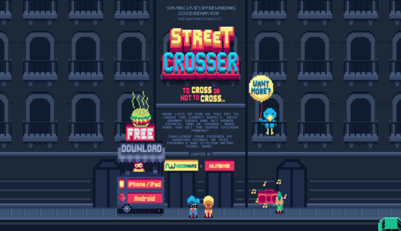
1. Street Crosser Game
The winner of this week’s Web Top 5 Award, is awarded based on its innovative use of a gaming theme to highlight a good cause, in this case crossing the road safely. Taking inspiration from the classic game, Frogger, the website sticks faithfully to its theme, even through its use of video, where it cleverly adds the styling into the live interview video. We really like this site.
2. For Brands
The second site in the Web Top 5 this week, is the For Brands website. Simple, minimalist and with a stylish linear feel throughout, the site is extremely elegant and really shows off its brands in a successful manner. Great photography throughout is also key to the success of this linear layout.
3. Hackaball
A simple promotional page that makes great use of video as well really highlighting its product. We like this site for its dynamic, animated outlook, leading through to the more subdued Kickstarter homepage. On a side note, we were also impressed by the innovative product itself.
4. Creative Spaces
The Creative Spaces website is a welcome addition to this week’s Web Top 5, with an effective navigation, that we believe more rental agencies should look to imitate. It’s a simple system, but one that really places the power in the hands of the buyer.
5. ColourCo
The final site on this week’s Web Top 5 really appeals to the designers in us all. Identifying colours on the page, the site is a simple idea, but one that is endlessly effective and useful.
Do you have a site you want us to look at?
Every week, the StrategiQ team are looking for their favourite websites – so tweet at us or email us a suffolk@strategiq.co to get featured!
Or, are you a potential client and want our web designers or web developers to have a look at your website? Get in touch!
In the meantime, check out our client case studies!
