Every Monday, the StrategiQ Team make their picks as to their top 5 favourite websites of the week.
And the winners are…
1. New Order
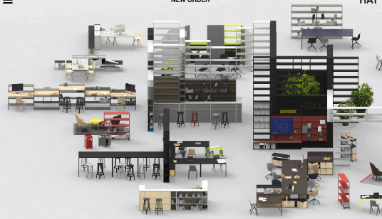
The Winner of this week’s Web Top 5 is the New Order site from Hay. An extremely clever homepage navigation is the feature that really gives this website life and works to highlight its high end products in a really impressive manner. Its clean design and sharp imagery throughout ensure that this site continues to be impressive beyond the homepage.
2. Dream and Reach
The second site in this week’s Web Top 5 is a really impressive website from Bose. The Dream and Reach site opens with a fantastic piece of video, before moving into a clever navigation, that could certainly prove the ultimate online time waster for casual browsers. Muted colour palettes and clever use of tech push this site to number two.
3. Hexagone
The Hexagone site is the third site on the list this week and it achieves this based on bold design choices. By removing colour from the imagery, it gives it a bold, classic quality that really matches the persona of the restaurant in question. We really like this site.
4. Hello Monday
The Hello Monday site is another website that uses a really clever user journey and could certainly be considered a real time waster of a website. It’s unique and individual design really sets it apart with an interesting colour palette and good use of cartoons.
5. Cheval Blanc
The Cheval Blanc site is the last site in this week’s Web Top 5. It perfectly fuses the use of video, imagery and sound to create a really classic persona that oozes the class of the brand. Definitely worth having a click through this website.
Do you have a site you want us to look at?
Every week, the StrategiQ team are looking for their favourite websites – so tweet at us or email us a suffolk@strategiq.co to get featured!
Or, are you a potential client and want our web designers or web developers to have a look at your website? Get in touch!
In the meantime, check out our client case studies!
