Subaru Zero Landfill – Becoming Environmentally Friendly
This may be a website that’s been on the scene for some time but, while researching for a recent project, I came across the Subaru Zero Landfill microsite which cleverly adapts a more traditional timeline into something that complements its ‘environment’.
Now, Suburu may not be the first manufacturer that springs to mind when naming environmentally friendly brands, nor do they champion the development of ‘green’ electric or relatively economical cars; they only have one hybrid in production and their worst car produces 242g/km co2 of emissions, a staggering 75% more than the average car. However, they’ve forged their way to becoming leaders in green production. They were the first manufacturing facility in America to reach zero-landfill status back in 2004 and all Subaru vehicles are now built in zero-landfill plants, where 100% of manufacturing waste is either recycled or turned into electricity.
Having proudly held their zero-landfill status for over 10 years, Subaru launched a microsite to raise awareness of their environmental achievements. The landing page presents a full width image of the Yosemite National Park, overlaid with an introductory caption that is surrounded by a circle of thin white dots. The photograph moves subtly in the background until the user hovers over the ‘start exploring’ link, which, in turn, instantly zooms further into the image. This movement, coupled with the lightening of the dark overlay and the strengthening of the photograph’s saturation, intensifies the user’s focus – perhaps a rather symbolic series of actions that indicates a cleaner and brighter future from curbing additional waste produced by factories.
The User Journey
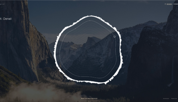
When the user enters the main site, the dotted circle shrinks to form the centre of a series of organically shaped, diagrammatic and concentric circles which multiply and grow outwards. An outer circle then proceeds to bleed around the shapes within it, forming a protective barrier. It’s apparent that these are rings of a tree – the ideal metaphor used to form the main navigation and structure of their timeline. As growth rings of a tree form in a yearly cycle, they act as a record, showing variations in surrounding conditions throughout its entire lifespan. Subaru have applied this same thought process to demonstrate their environmental history in a quirky, relevant and visually immersive experience.
Within the concentric circles, a selected year shows a larger ‘knot’ which intuitively looks clickable. Featured to the left hand side of the page is the year, month and title of the key event highlighted on the diagram. Secondary to this is a numerical indicator, showing how many events, or pieces of ‘featured content’, appear within the selected year. The featured knot then changes automatically every 5 seconds to keep the user engaged, and also encourage them to interact with the tree diagram and make a selection themselves.
As the user interacts with the rings on the ‘tree’, each ring animates depending on which one is hovered over, revealing in the centre the date selected and presenting larger clickable ‘knots’ where key events occurred. The initial information presented on the left-hand side of the page then fades, so that the user can focus on the diagram’s navigation. When hovered over, a simple and clean white line extends from the selected ‘knot’, where the month and a short event description gives a little more insight into the topic covered. An icon for each key date indicates if there is an additional photograph and short paragraph to view, or if there is a video available to watch. By providing the user with more guidance as to what content is available and where it helps them to decide what information they might want to engage with.
When an event is subsequently selected, the site then takes the user to a new page and the chosen tree ring opens up to form a more traditional, linear timeline, broken down into days of the year. This is a beautiful transition which feels smooth and effortless, without needing any loading time. There is an option to the right-hand side of the screen which changes the view of the linear timeline into months, or indeed back to the year overview seen at the beginning. Additionally, users can view results by category rather than the default setting of time, which provides further choice and complexity to the navigation.
A circular-shaped cropped photograph now sits centrally in the screen and a handy prompt notifies the user that they can swipe left or right to navigate through the year’s timeline, should they wish to view another event. The smooth yet organic timeline subtly changes using a similarly smooth and organic motion, activated when either hovered over, or dragged across the screen. The handy prompt also changes, instructing the user to click on one of the circles in order to open up more information. When a circle is hovered over, the photograph expands slightly, while another animation indicates that the image should be selected. All the animations and transitions add to the overall website experience and engage the user throughout their journey, without being over the top.
Once a circle has ‘opened’, a paragraph with either a photograph or video is displayed and the user is then able to select the next or previous event from this screen, should they wish to. Subaru has deliberately chosen to use a simple sans serif font and navigation elements in white, so that the focus remains on the photography. To promote Subaru’s name and their positive environmental impact, they have included the feature to share and pin each of the key dates in order to pursue a wider audience. The website also includes a separate area which lists helpful tips for the general public to support parks reach zero landfill status, via a ‘how can I help?’ link. Whilst the content is a nice addition, it lacks the same visual engagement and interest that the homepage provides, which is a little disappointing. With a little added thought, Subaru could have drawn from their inspiring tree ring metaphor and created something to compliment the homepage to complete the user’s overall experience.
Nevertheless, I think this is a quirky website from Subaru, who clearly tasked their creatives to think outside of the box and amalgamate small snippets of information, spread over a period of time, to create a bigger picture in an engaging way. This however had to be achieved while ensuring the theme applied to the UI and UX was sympathetic to the subject, and linked neatly back to the purpose of the website – Subaru’s environmental history. The transitions and animations breathe essential life into this microsite and transform what could have been a flat and rather uninspiring design, into something much more enlightening and engaging. Check out the website here to see for yourself.
Do you have a site you want us to look at?
Every week, the StrategiQ team are looking for their favourite website of the week – so tweet at us or email us a suffolk@strategiq.co to get featured!
Or, are you a potential client and want our web designers or web developers to have a look at your website? Get in touch!
In the meantime, check out our client case studies!