Every Monday, the StrategiQ Team make their picks as to their top 5 favourite websites of the week.
And the winners are…
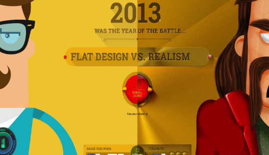
1. Flat Vs Realism
The winner of this week’s Web Top 5 is a clever parallax site, highlighting the ongoing battle in the design world, between flat design and realism. Telling a story about the battle between the two mediums inhabited by some enjoyable cartoon characters, the site makes the most of sound and animation throughout the scrolling user journey. An impressive interactive battle sequence is another nice addition to the site which draws the tale to a close in an enjoyable manner, adding a nice sense of closure when the sites’ tale comes to an end. A worthy winner, based on a very relevant topic.
2. World Science U
The second site on our list is the World Science U site. Essentially an educational site, we were really impressed with this site’s enjoyable interface and user journey. A simple, fairly linear outlook on a cosmic theme really adheres to the brand of the website, and creates a dynamic appearance which will work to draw people further into the site. Extensive use of video is also an important factor on the sharing of information on the site, continuing to add to its unique dynamism.
3. Owegoo
Rounding off the top three sites on the list is travel site, Owegoo. Offering a search function based on what people want to do on their holiday, Owegoo is already a unique service. It’s colourful flat design is important to developing its individual appeal, which is no doubt a quirky method of keeping people engaged on-site and searching for their next dream holiday.
4. Anatomy of a Pitch
ESPN’s Anatomy of a Pitch website is a welcome addition to the Web Top 5 this week. A nicely designed site, conforming to the dynamic colour scheme of the ESPN brand, Anatomy of a Pitch offers a selection of 8 MLB pitchers, which inhabited by an interactive interface builds a real time waster of a website. Even for non-baseball fans, this is a fun site.
5. iversity
The fifth and final site in this week’s Web Top 5 is a very linear, but very aesthetically appealing website which is characterised by its expert usage of imagery. The homepage hero imagery is extremely inviting and the squared persona of the news/blog page continues is in keeping with the linearity of the brand.
Do you have a site you want us to look at?
Every week, the StrategiQ team are looking for their favourite websites – so tweet at us or email us a suffolk@strategiq.co to get featured!
Or, are you a potential client and want our web designers or web developers to have a look at your website? Get in touch!
In the meantime, check out our client case studies!
