Every Monday, the StrategiQ Team make their picks as to their top 5 favourite websites of the week.
And the winners are…
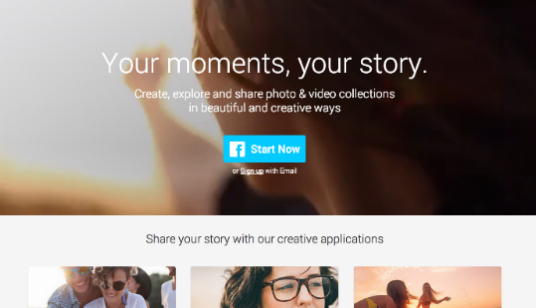
1. Slidely
This week’s number one choice achieves the title based on its prowess as an excellent and innovative extension to social media platforms. As an application, the site allows users to create slideshows, videos and galleries with uploaded photographs from their Facebook page. Whilst not the first application of this nature, Slidely allows users far more freedom of expression, with the option to add songs from YouTube essentially gifting an endless supply of popular music without cost. The site is a wonderful example of the power and potential of social media as a creative tool, and an original method of combining multiple profiles to create something beautiful.
2. Valentino
Our second choice this week is an excellent example of an aspirational brand creating a website that reflects the brands prestige. Making excellent use of the company’s stunning surroundings, the Valentino website opens with as stylish video, teasing the creation of a flagship Manhattan store. Further exploration of the site reveals a chic use of a muted colour pallet and continued investment in the use of video which gives the website a really individual, unique feeling that perfectly compliments the brand’s aspirational nature.
3. Godzilla
Breaking into the top 3 is a promotional website for one of 2014’s biggest films, Godzilla. The film’s dark colour pallet and overarching theme of mystery is well recreated here as the website’s hero imagery fails to explicitly reveal Godzilla in all his glory. Whilst a clever parallax is a fun method of navigation, it is the title’s rich fan-friendly content that really elevates the site, including downloadable posters and a Godzilla “Roar” ringtone. The creation of a conspiracy theory style site to accompany the main website is also an innovative touch.
4. Blue Dolphin
Another aspirational brand that uses its environment extremely well is Blue Dolphin Tours, with a beautiful selection of photographs forming the basis of a very attractive homepage. In itself, it is very simplistic and bold text is a perfect accompaniment to the powerful, attractive imagery. Delving into the specific pages reveals more stunning photography and while the content is a little basic it contains everything one would need, keeping the focus on the brand’s aspirational imagery.
5. Morgan Motor Company
Morgan’s official website rounds off this week’s choices, with its gorgeous photography and innovative car creation system really reflecting the car’s prestige. Morgans unique appeal and rich heritage of motoring prestige is well presented here, with the company’s history thoroughly explored in a way that will please die-hard Morgan fans. For everyone else though, the Car Creator is serious fun. What do you think about our choices, do have a favourite website? If so, we’d like to hear it.
Do you have a site you want us to look at?
Every week, the StrategiQ team are looking for their favourite websites – so tweet at us or email us a suffolk@strategiq.co to get featured!
Or, are you a potential client and want our web designers or web developers to have a look at your website? Get in touch!
In the meantime, check out our client case studies!
