
Google’s shift to mobile-first indexing has been well charted and expected. Google loves mobile because people seem to – and regardless of whatever you believe about their intentions, Google makes it their business to give people what they want. It’s worth a lot to them!
SEOs have been pretty interested in this, and rightly so. If you’ve not seen/heard much so far, you could plot the potential impact of the Mobile First Index (MFI), it is somewhere between ‘barely noticeable’ and ‘epoch-defining’.
For those who remember mobilegeddon, the millennium bug and the CERN Black Hole, they may be forgiven in drawing a parallel with MFI, playing down the potential impact and calling for a greater sense of calm.
Although within the last 6 months, there has been some progression in this area that has brought about some sobering conversations, and more importantly, has highlighted what damage may come of it.
What is the Mobile First Index?
So many have described this in more depth than I intend to here, but to understand what the MFI is, it’s best to understand how it works. Currently, Google crawls the web and renders/views the web as if they were on a desktop. Rankings are then determined based on the desktop assessment and any modifiers are applied to mobile. The MFI turns this on its head as Mobile becomes the primary method of searching as well as the primary way Google crawls and indexes content.
Desktop will now play second fiddle.
The implications? Anyone who has radically different mobile/desktop experiences and sees mobile as being the “lesser” version could have some turbulent times ahead.
But what IS the MFI really? I think it should be, at least, a massive wakeup call.
The majority of experienced SEOs have written off MFI as being a huge problem. If nothing else, it’s because they’re working on responsive websites… and responsive sites are safe. Right?
Half-right! Responsive sites are recommended by Google as they, in theory, offer a good experience for the user without causing unnecessary drama for Google bot. Compare this instead with separate mobile websites, which need to be declared and mapped against their desktop counterparts. This process has been messy and more resource intensive at the best of times and is about to get a whole lot worse.
Moving to a Mobile-First Mindset
I not sure we are ready for this shift.
Maybe you could say that the entire industry isn’t ready. Despite the fact we’ve had at least 4 or 5 “years of mobile” proclamations from Google (and others) in the last decade, very few seem to really act like the mobile is the primary device for the majority of users.
And this is a problem.
When I polled SEOs on Twitter, 57% said that desktop was their first port of call – you could count me in this too.
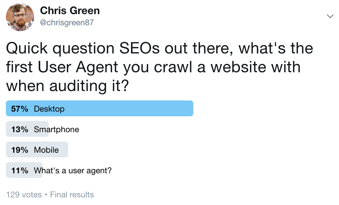
We audit sites on desktop because it’s easier (yes, I’ve tried on mobile), we crawl sites using a desktop UA and we report on desktop rankings ahead of mobile. We (the industry, in its majority) do not seem to be considering their websites as they should.
Making “mobile first” SEO Practice
How do we change then? Like all things, this will take training. Some may already be working like this but the majority aren’t.
The following points, when they become second nature will ensure you’re viewing/marketing the mobile site as the lead version – all your key measurements mobile prioritised, as they should be.
- First, check which is the dominant device used to access your site – via Google Analytics & Google Search Console data. Unless mobile is a small portion of traffic, treat it, at a minimum, equally to desktop.
- Make your first manual pass on a site on the mobile version. Use chrome developer tools to emulate a Nexus 5X – the UA Google uses to render mobile sites. What is the user experience like?
- Run at least two audits (crawls) for a site – one mobile, one desktop – compare the data and look for gaps. Barry Adam’s recommended this using SiteBulb as part of his BrightonSEO talk – so I can’t take all the credit.
- Learn to love Google Lighthouse and get familiar with how to build and measure a high performing website here.
- Lead your ranking reports with mobile data if it drives the most traffic – they’re the most important rankings.
- Base your first recommendations on a mobile Search Engine Results as the search features will impact Click Through Rate far more than on desktop
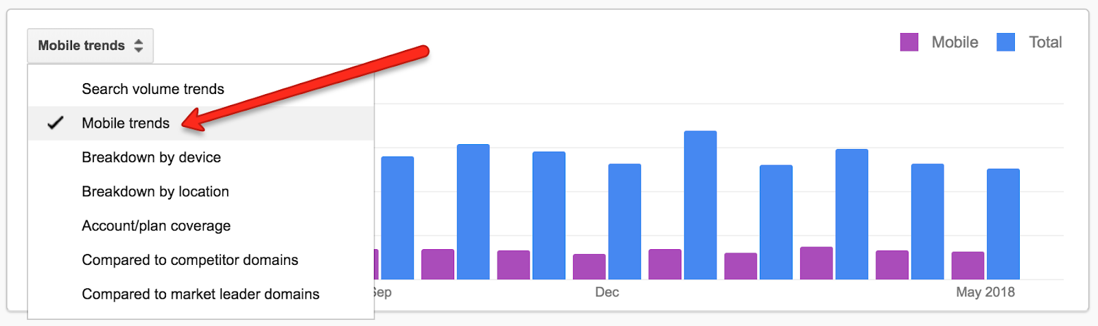
- Use Keyword Planner’s Mobile trends data – mobile search trends will surprise you if you’re not used to looking at it.
When a Mobile Mindset Will Receive Excess Scrutiny
“But my website is B2B” or “but my top converting traffic is on desktop” are two possible suggestions people make to help themselves feel better about not worrying enough about mobile. This doesn’t matter/won’t matter for much longer, because more and more people will continue to shift to mobile. Even if the desktop stays the main source for conversions, just focusing on that is missing the top-funnel traffic – which is hugely important.
Just remember – this is not going to stop any time soon. As the SEO community are getting excited about the possibility of PWAs, on the other end of the spectrum there are hundreds of websites which barely perform on any device – they will not have a fun time of it.
If you have a separate mobile site or very different desktop/mobile versions (even via responsive design), you may find your rankings impacted.
Google has clearly defined that mobile content is what’s going to be ranked and there is no simple negative impact applied as a blanket – this will not stop many from assuming they’re getting penalised in some way or another. Stop looking for things which confirm what you already think you know and start thinking with a mobile-first mindset.
Is your website the best result for the search terms you’re looking for on mobile? Focus on answering that question as “yes” and worry less about the introduction of MFI.


