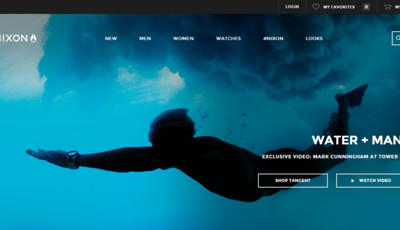
Read why the Nixon site is our chosen Website of the Week this week!
Design – Sleek & Simple
The Nixon website is a beautifully sleek and simple design, with most of the eye catching areas coming from the imagery used. All aspects of the design, from typography to buttons are extremely simple, and the utilisation of the ghost button design on darker images is a real joy.
Call to Actions
Every call to action is designed the same way (ghost buttons), which helps massively with user journey. When users navigate away from the homepage onto a child page, they are presented with a header image, displaying a product with nice imagery and a and a call to action button to ‘Buy Now’.
Easy User Journey
Straight from landing on the homepage you are presented with an easy to use navigation menu, the design of the pages and the menus and buttons stays the same the whole way through the website allowing for a really easy user journey, and means going from one part of the website to another is only a few simple clicks away.
Video – Perfect Dynamism
The video on the homepage is awesome, and totally in keeping with the dynamism of the website and the brand. Video is becoming ever more important online, and websites that use it to its full potential are often the best on the web, Nixon certainly falls into that bracket.
Mobile Responsiveness
It is always impressive for a website to be as enjoyable experience on mobile as it is on desktop, but the Nixon site is one of a rare breed that achieves this unique feat. All of the above points still apply to the mobile version, without the typical trade off that exists with responsiveness in websites.
To visit the Nixon site, click here.
To see how StrategiQ can help you with your website design needs, get in contact today.
