Lily Camera – Stylish & Simple
This weeks web awards goes to the ‘Lily’ website which showcases an amazing drone camera named Lily, the optics are finely tuned to capture stunning pictures and video from the skies. No controller is required, you literally through the camera in the air and it flies itself to capture your adventures.
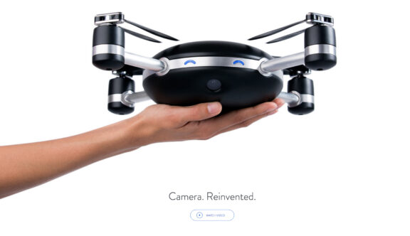
This is a parallax web site where the parallax sliding is used to full effect to demonstrate how the camera works. Going against the norm the home page has zero navigation at the top, risky in some cases but not for this site, so the first thing you see is a huge striking product shot, that really shouts ‘Look at Me’.
There is a strong call to action to ‘watch the video’, which is beautifully shot from Lily’s perspective high in the air and cut together into a short and snappy promo really selling this cool tech product. Resting at the page fold is an option to view the Tech Spec and a Pre Order button.
This is a perfect example of how to not overpower the page with too much noise, what I call the ‘buy me, why me call’ outs. The product shot of Lily and the video is the pitch, the quiet pre-order button takes you to the costs and a no nonsense purchase form, a short amount of fields to complete – A good template.
Scroll down further and the parallax animation begins, with clear steps informing you of how Lilly works using minimal words like ‘Ready, Throw, Go’. Then a graphic of a skier moves down the slope with Lily flying with them, leading to further interesting information.
This site is stylish with its simplicity, the fact that all the information is there and easy to find, the vector graphics at the bottom where you see the evolution of the camera is clever and then you see the full navigation menu taking you to the blog, contact, jobs etc.
Speaking as a Creative Director for me all the elements are there and in tune, by that I mean the branding fits the product really well, with it’s minimal, tech based electric blue square with eyes, befitting to Lily – the robot flying machine that has a personality, just like the website.
The message in the content is subtle yet powerful, carefully crafted content is a skill and in Lily’s case their message is on brand, less is more. That could be a problem from an SEO perspective minimal content creates a ranking issue, but the sand is always shifting and it’s the integrated approach that works.
Which is where Lily also has it right with a great video promo that has gone viral, a blog that’s building advocacy and drama on the build up to release. Their social out reach is strong, their marketing strategy is an integrated one which is successfully pushing their product and love of it out there.
Admittedly I love photography, filming and all things tech so this product is pressing all my buttons, brilliant, I need to get to California to see it in action now!
To view the Lily Camera website, click here
