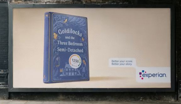
Last weekend, while nursing a mild hangover on the District Line, my gaze drifted up to the ad panel facing me. As anyone who works in advertising knows, you don’t just look at a new campaign; you dissect it. I’ll be honest, I had to read this one several times before I landed on, “Interesting approach.” It felt slightly cryptic, definitely different, and – in that way we often assume about high-concept work – it seemed like it was ‘probably clever’.
I sat there processing it: Seven-seater… oh, right, not seven dwarves. Okay. Experian… hmm. A seven-seater sofa? As if that would ever fit in my London living room. I was snapped back to reality by my friend, who was now staring at the same ad with a look of pure bewilderment. “Snow White and the what?” she asked. “Aren’t Experian the credit people? What’s that got to do with Snow White… or sofas?” She followed this with a slight eye roll and a shrug before hitting me with the ultimate question: “Does this stuff actually work?”
We spent the rest of the journey talking about how, while it was visually appealing and clearly “smart,” the meaning felt buried, to say the least. The link to “the credit people” felt unduly tenuous when you’re just trying to get from A to B on a Sunday afternoon.
I arrived at work the following morning to an excited Senior Designer who couldn’t wait to show me the “brilliant” new campaign for Experian. I laughed to myself – that thing? – but I hid my scorn and heard him out. He insisted the video was the crucial underpinning of the whole thing. I watched it and, to be fair, I agreed it was impressive. But it also left me more conflicted than before.
What is the actual likelihood of every person who sees that OOH panel also having seen the cinematic video that explains it? If the OOH relies on the film to make sense, what does that mean for the campaign’s effectiveness? Or were my delirious, hungover eyes just deceiving me?
As the day went on, my LinkedIn feed was wallpapered in rave reviews for it. And they aren’t necessarily wrong, I actually do think it’s a clever platform and I genuinely love the visual expression. But I couldn’t help but wonder if this is just another great example of making ads for ad people.
Do the people who actually matter, the ones who aren’t “biologically wired” to spend 50% of their commute analysing brand strategy – actually get it? Because my hungover self almost didn’t, and I’m the target audience for the industry awards. Only time will tell if this campaign is a stroke of genius or just a bit too aesthetic for its own good.