If you’re anything like us at StrategiQ, you probably have a few favourite brands that you consistently receive emails from for news, offers and deals. But have you ever taken a step back to truly admire the layout, graphic design and content of your emails?
In celebration of awesome email newsletters, we’ve compiled 10 of our favourites, and broken down what we love most about them.
Cook Smarts
This Cook Smarts email is perfect for foodies who don’t mind trying out new things. While the recipes look great, it’s the simple, clever layout of the email that makes this email stand out. With three distinct sections – menu, kitchen how tos and tips – everything is right where users need it, saving them from wasting their time scrolling up and down to find the info they want. Super-shareable and good fun, this is what emails should look like.
Loft
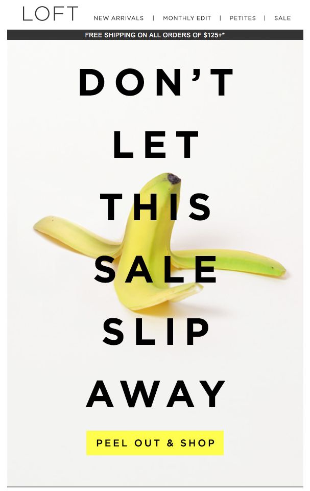
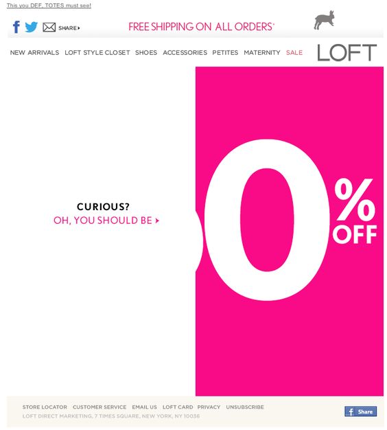
Emails don’t have to be long and complicated to be effective. This email stands out through its relative simplicity. Gambling on the recipients’ curiosity, Loft gives very little away, but its use of bold imagery and smart text entices its customers to find out more, whilst adding that all-important sense of urgency. Next time you’re creating a sales email, why not strip it back a little bit?
Jessops
Conversely, information and detail are certainly not bad things, as proved by Jessops’ autumn email. Themed around the Harvest Moon, this email showcased how important timing can be, effectively tying in current events with the company’s products, and maximising the appeal with bold, enticing imagery and a number of links to engaging content. Content, imagery and purpose working in perfect harmony.
JetBlue
JetBlue takes the unique approach of using its customers’ data to create a striking, personalised infographic to round up its annual activity. The email effectively fulfils its dual purchase of thanking existing customers for their loyalty, whilst also subtly putting their travel plans at the front of their mind. With personalisation becoming ever more important, it’s refreshing to see a brand go to such lengths.
Missguided
Re-engaging inactive users is one of the toughest tasks that email marketers face, but Missguided approaches the task head-on with humour and creativity. With a minimal design, Missguided lets its message do the talking, with a little dose of humour and emojis creating a personal and fun campaign.
J. Crew
Let’s be honest, everyone loves ice cream! So it makes sense that J. Crew would use ice cream (something that has nothing to do with their brand) to tempt people into its sale. The recipient is immediately put in a good mood by the appearance of their favourite sweet treat, and the long scroll will only serve to enhance this effect.
Need Supply
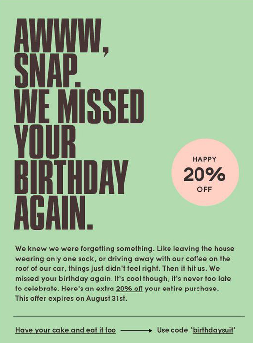
Receiving birthday emails is nothing new, so standing out from the crowd can be tough. Need Supply tried a different spin on the ol’ birthday email trick, sending a late birthday message to its email subscribers. Their personal message positions the brand as a close friend, and the simple design gets straight to the point, enticing its recipients further down the buying journey.
Urban Outfitters
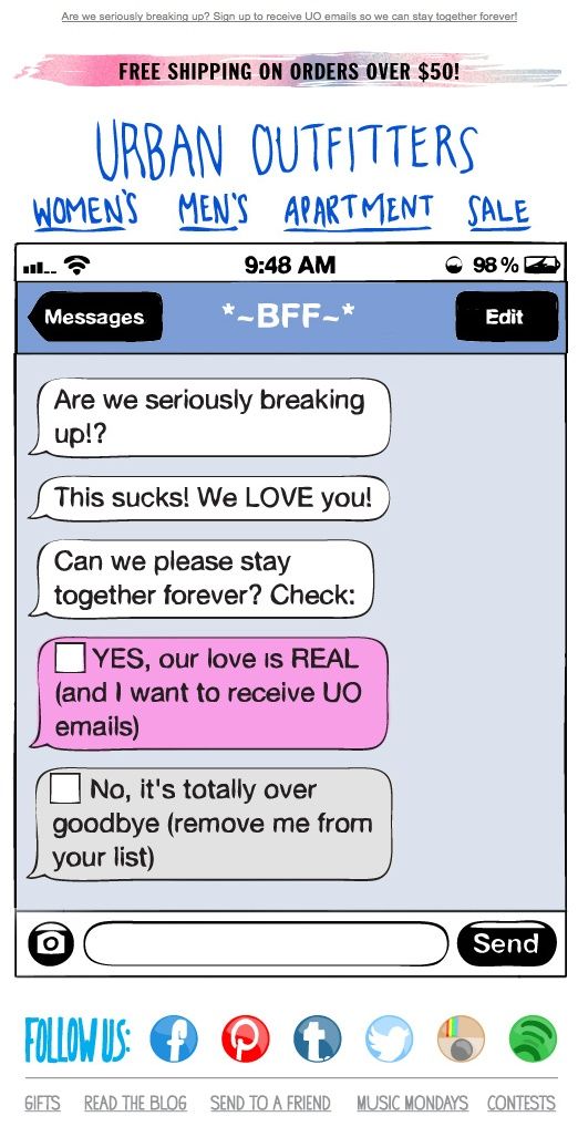
We love this personal chat style message from Urban Outfitters. Not only is its fun, quirky campaign extremely relatable to its target audience, but the email is also a fantastic, creative example of how to re-engage lapsing recipients. As mentioned above, this is never an easy task, but Urban Outfitters has done a great job of adding some genuine value to its customers.
Loft
Deja vu, it’s Loft again! Another simple, but a playful example from the clothing outlet. By not revealing the full discount being offered, Loft plays up to that little bit of curiosity in all of us, enticing us to find out exactly what we can save. Spoiler alert: it’s 50%! One of the biggest challenges facing email marketers is encouraging people to click, so why not take the Loft approach?
Midtown Comics
You didn’t honestly think I’d get through this blog without at least one Marvel reference, did you? Midtown Comics sent me this email due to my previous engagements with them, specifically relating to Marvel comics. Making perfect use of a colourful and dynamic subject matter to build a bright and bold email, with my interests and strong calls to action front and centre, this is effective, targeted email marketing at its best. Also, yay Marvel!
If you would like to discuss your email strategy, please don’t hesitate to get in touch.today. We’d be delighted to help!
